
Ad creative
Mobile Ad Text: Make a Short Message Readable
By Memes.ai
Updated October 16, 2026 · 5 min read
A headline that reads well on a large editing canvas can disappear in a small feed image. Review the exported file at the size a reader will see. The fictional stationery examples show a shorter message, clearer contrast, less competing pattern and a final-size review. This is an editorial check, not a formal accessibility audit or a platform-specific text rule. Verify the requirements of the actual placement separately.
What you’ll take away
- Inspect the export rather than only the editing canvas.
- Compare words against the actual background and crop.
- Move optional detail into the caption before making essential type tiny.
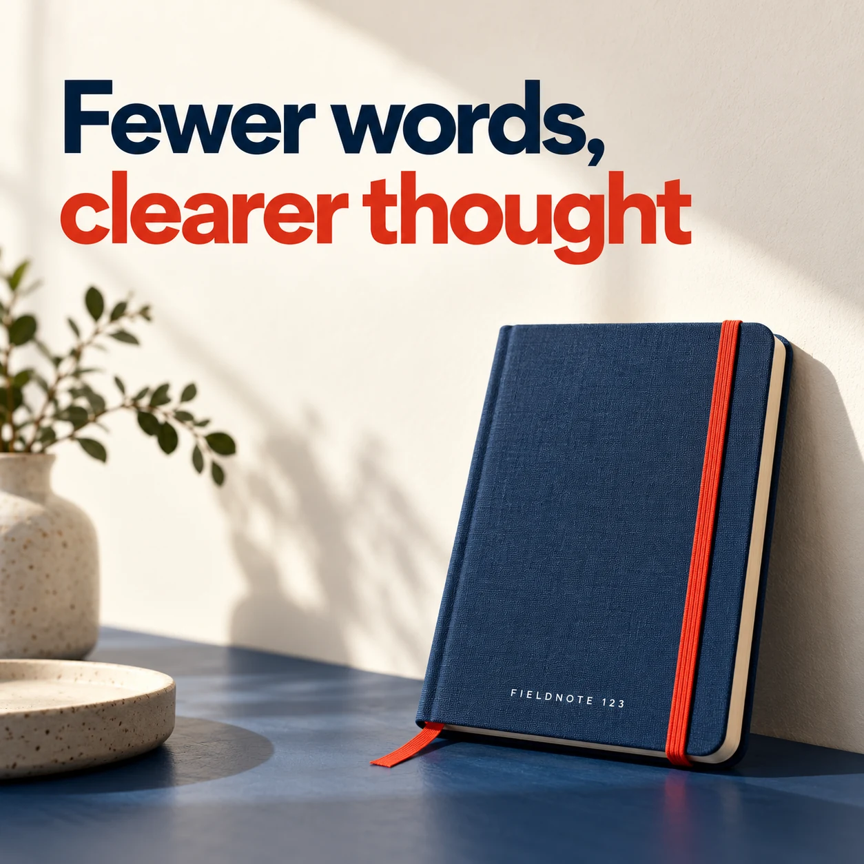
1. Fewer words, clearer thought
Original AI-generated fictional campaign concept. No real customer or measured result is represented.
Finished example caption — Keep the main message short enough to read beside the visual.
Why use this post — A shorter line leaves space for both the product and the message. It removes words that do not need to be read inside the image.
Make it your own — Keep the main approved meaning while cutting repeated words. Put qualifications that still matter in visible accompanying copy.
Image brief to adapt
Generate one complete polished square campaign image, 1080×1080. The exact scene is: one notebook with a large two-line headline above. Context: a fictional stationery brand with notebooks and bold original type. The message is “Fewer words, clearer thought”; support this finished caption: “Keep the main message short enough to read beside the visual.”. Environmental wide shot with the key subject in the lower right and generous clean upper-left negative space. Art direction: art-directed studio campaign photography with strong shape, disciplined typography and useful visual hierarchy; palette ink blue, cream and vermilion; refined natural lighting, deliberate depth and texture, commercially credible proportions, clean edges and ample breathing room. Use exactly this headline: “Fewer words, clearer thought”. Add the small fictional wordmark “FIELDNOTE 123”. Headline must be immediately readable at a phone size, with high contrast and a safe inset of at least8% from every edge. The scene is the main visual, not a text-only card. No additional text, UI screenshot, testimonial, metrics, sale badge, fake website, QR code or placeholder field. No watermarks or unrelated logos. Check current placement rules separately; no universal minimum font claim. Produce finished actual raster artwork ready to download and inspect; no wireframe, simple geometric substitute or diagram.
2. Put contrast to work
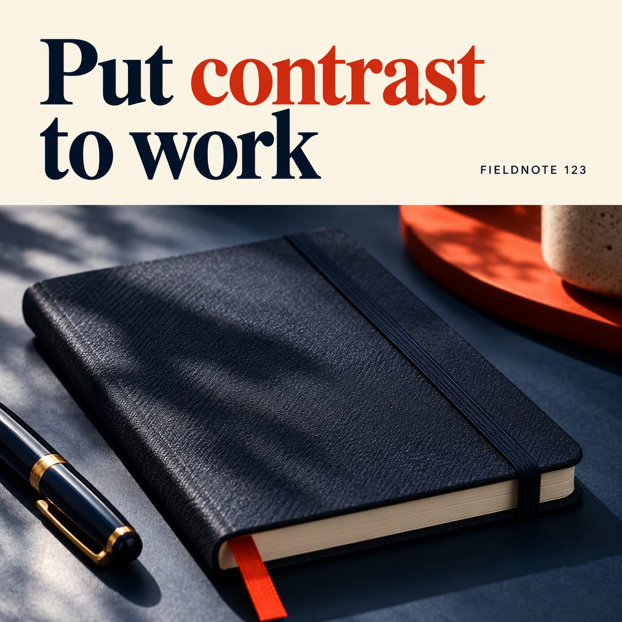
Original AI-generated fictional campaign concept. No real customer or measured result is represented.
Finished example caption — A clear contrast between letters and background helps the words stay visible.
Why use this post — A clear text area separates letters from the product's surface. It can make a message easier to judge without inventing a minimum font size.
Make it your own — Check the actual color pair and final compressed export. Do not claim a color scheme is accessible without an appropriate assessment.
Image brief to adapt
Generate one complete polished square campaign image, 1080×1080. The exact scene is: dark notebook below a high-contrast cream text area. Context: a fictional stationery brand with notebooks and bold original type. The message is “Put contrast to work”; support this finished caption: “A clear contrast between letters and background helps the words stay visible.”. Close editorial still life or detail crop showing the relevant physical object and its texture, with the headline in a quiet top band. Art direction: art-directed studio campaign photography with strong shape, disciplined typography and useful visual hierarchy; palette ink blue, cream and vermilion; refined natural lighting, deliberate depth and texture, commercially credible proportions, clean edges and ample breathing room. Use exactly this headline: “Put contrast to work”. Add the small fictional wordmark “FIELDNOTE 123”. Headline must be immediately readable at a phone size, with high contrast and a safe inset of at least8% from every edge. The scene is the main visual, not a text-only card. No additional text, UI screenshot, testimonial, metrics, sale badge, fake website, QR code or placeholder field. No watermarks or unrelated logos. Check current placement rules separately; no universal minimum font claim. Produce finished actual raster artwork ready to download and inspect; no wireframe, simple geometric substitute or diagram.
3. Remove the competing detail
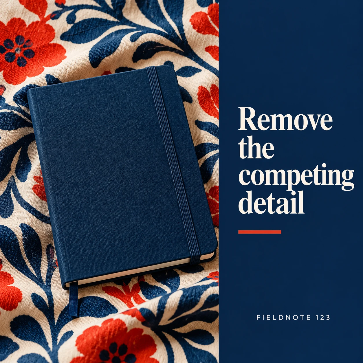
Original AI-generated fictional campaign concept. No real customer or measured result is represented.
Finished example caption — A decorative pattern should not obscure the message someone needs to read.
Why use this post — Pattern can compete with a headline. A quiet panel lets the message and the styled scene do different jobs.
Make it your own — Reduce the distracting pattern or move the type to a quiet area. Preserve factual product color and detail.
Image brief to adapt
Generate one complete polished square campaign image, 1080×1080. The exact scene is: notebook on patterned cloth with a clean solid type panel. Context: a fictional stationery brand with notebooks and bold original type. The message is “Remove the competing detail”; support this finished caption: “A decorative pattern should not obscure the message someone needs to read.”. Natural eye-level composition with a restrained side panel for type. Preserve the exact stated scene; do not add a person to an object-only scene. If the scene includes people, use adult models and the explicit stated action only. Art direction: art-directed studio campaign photography with strong shape, disciplined typography and useful visual hierarchy; palette ink blue, cream and vermilion; refined natural lighting, deliberate depth and texture, commercially credible proportions, clean edges and ample breathing room. Use exactly this headline: “Remove the competing detail”. Add the small fictional wordmark “FIELDNOTE 123”. Headline must be immediately readable at a phone size, with high contrast and a safe inset of at least8% from every edge. The scene is the main visual, not a text-only card. No additional text, UI screenshot, testimonial, metrics, sale badge, fake website, QR code or placeholder field. No watermarks or unrelated logos. Check current placement rules separately; no universal minimum font claim. Produce finished actual raster artwork ready to download and inspect; no wireframe, simple geometric substitute or diagram.
4. Check the actual export
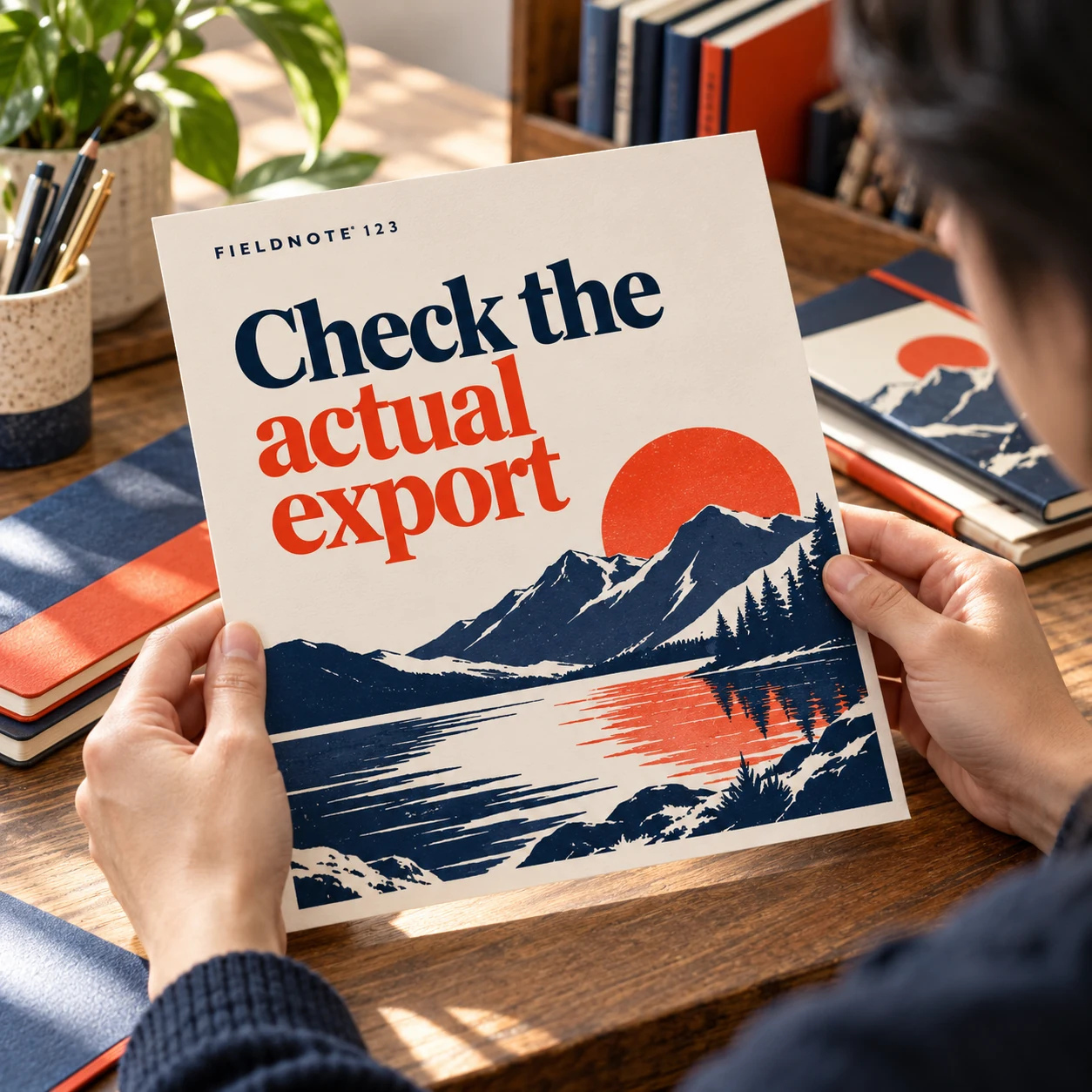
Original AI-generated fictional campaign concept. No real customer or measured result is represented.
Finished example caption — View the finished file at phone size before approving the text.
Why use this post — A final-size check reveals problems hidden by zooming in. The approved file must be the same file the reviewer checked.
Make it your own — Open the exported file on a phone or at an equivalent preview size. Check text, crop and logo; do not use a print viewed from far away as the only final-device check.
Image brief to adapt
Generate one complete polished square campaign image, 1080×1080. The exact scene is: adult holding a printed original creative at a small viewing distance. Context: a fictional stationery brand with notebooks and bold original type. The message is “Check the actual export”; support this finished caption: “View the finished file at phone size before approving the text.”. Confident final hero composition using a clear foreground subject and supporting background context; close the sequence with a purposeful visual invitation. Art direction: art-directed studio campaign photography with strong shape, disciplined typography and useful visual hierarchy; palette ink blue, cream and vermilion; refined natural lighting, deliberate depth and texture, commercially credible proportions, clean edges and ample breathing room. Use exactly this headline: “Check the actual export”. Add the small fictional wordmark “FIELDNOTE 123”. Headline must be immediately readable at a phone size, with high contrast and a safe inset of at least8% from every edge. The scene is the main visual, not a text-only card. No additional text, UI screenshot, testimonial, metrics, sale badge, fake website, QR code or placeholder field. No watermarks or unrelated logos. Check current placement rules separately; no universal minimum font claim. Produce finished actual raster artwork ready to download and inspect; no wireframe, simple geometric substitute or diagram.
Put it into practice
Apply the workflow to one actual business image
Export one current draft. View it at the intended phone display size without zooming in. Record the exact word or line that is difficult to read and what competes with it. Make one change: shorten the line, separate the background or remove a secondary element. Export again and compare the two actual files under the same conditions. Confirm that the message still carries its required qualifications and that the destination agrees with it.
Put it into practice
Test a headline break without changing its meaning
Start with the original fictional headline “A clearer place for the next idea.” One draft can keep “A clearer place” together and “for the next idea” together. Another can shorten the message to “Room for the next idea,” but that is a copy revision and needs approval; it is not merely a line-break change. Keep the product and business facts fixed while reviewing either version.
View the actual exported graphic at the size at which the reader will encounter it. Ask someone to read the headline and identify the product without an explanation. Check whether a line break isolates an awkward word, a letter merges into the background or a small supporting line has become unreadable. Move secondary detail to the caption instead of shrinking it until it technically fits.
The image prompt can request exact words and a short headline, but only the finished pixels show whether those words are present. Inspect every character and the final crop. A phone-shaped preview is not proof that a specific platform will display the same crop; check the actual intended placement. Do not claim a universal minimum font size, platform policy or performance gain from this exercise.
Common questions
What font size should every mobile ad use?
This guide gives no universal minimum. Font choice, crop, display size and placement affect the result. Review the actual export and check the destination platform's current rules.
Can a textured background stay in the design?
Yes, if the text remains clear in the final use. Give the words an appropriate quiet area and inspect the compressed export at its intended size.
What can leave the image?
Move optional explanation or repeated words into the caption when the essential meaning remains clear. Keep necessary qualifications visible in the appropriate accompanying copy.
Is changing a line break the same as changing copy?
A line break can retain the exact words. Removing or replacing words changes the message and requires the relevant approval. Compare meaning as well as visual fit.
What should I do when the supporting line is too small?
Decide whether it belongs in readable accompanying text. Revise the layout or approved copy before reducing it further; inspect the final use-size export.
Turn the brief into your own creative
Use the example as a starting point. Supply approved business facts and authorized references in Studio, then compare the finished image with the brief before using it.
Your starter brief
Replace the brackets with your own details.
Generate one complete polished square campaign image, 1080×1080. The exact scene is: one notebook with a large two-line headline above. Context: a fictional stationery brand with notebooks and bold original type. The message is “Fewer words, clearer thought”; support this finished caption: “Keep the main message short enough to read beside the visual.”. Environmental wide shot with the key subject in the lower right and generous clean upper-left negative space. Art direction: art-directed studio campaign photography with strong shape, disciplined typography and useful visual hierarchy; palette ink blue, cream and vermilion; refined natural lighting, deliberate depth and texture, commercially credible proportions, clean edges and ample breathing room. Use exactly this headline: “Fewer words, clearer thought”. Add the small fictional wordmark “FIELDNOTE 123”. Headline must be immediately readable at a phone size, with high contrast and a safe inset of at least8% from every edge. The scene is the main visual, not a text-only card. No additional text, UI screenshot, testimonial, metrics, sale badge, fake website, QR code or placeholder field. No watermarks or unrelated logos. Check current placement rules separately; no universal minimum font claim. Produce finished actual raster artwork ready to download and inspect; no wireframe, simple geometric substitute or diagram.
Copy your adapted brief, open Studio, and paste it into your creative workflow. Review the result before using it.
Create your version in Studio