
Social media
Shop Relocation Posts: Help Customers Find the New Place
By Memes.ai
Updated October 16, 2026 · 4 min read
A shop move needs more than a new-doorway image. A customer may have saved an older post, address or collection instruction. Plan which place is current, what changes and where the reader can confirm the latest visit information. These fictional concepts illustrate that transition; they do not identify a real shop, address or opening date. The actual operator must approve every location and service fact.
What you’ll take away
- Separate the old-location record from the current approved visitor information.
- Check saved posts, collection instructions and contact destinations for conflicting location facts.
- A published image does not prove that a map/profile edit is live or that a new premises is open.
1. A new doorway
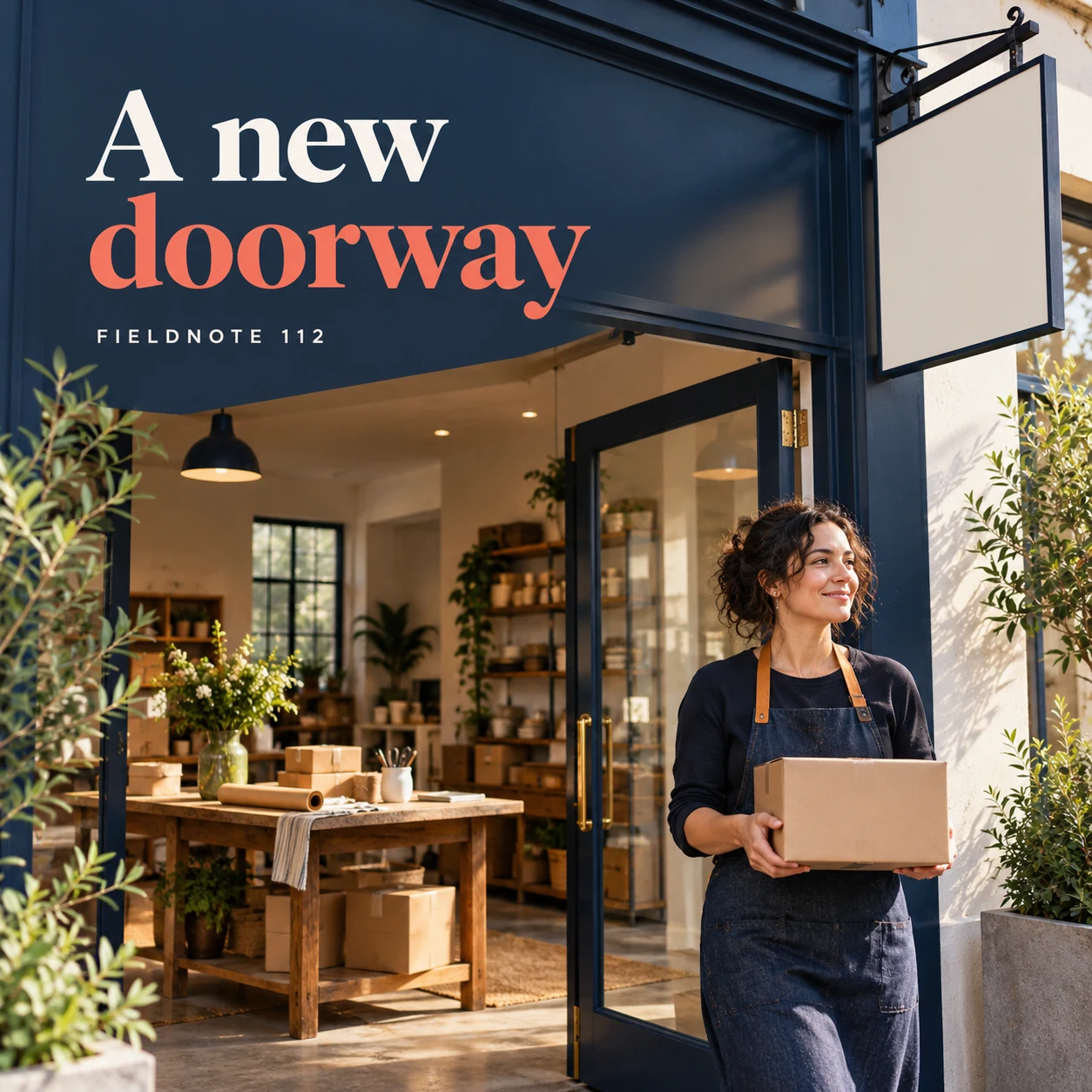
Original AI-generated fictional campaign concept. No real customer or measured result is represented.
Finished example caption — A clear photo can introduce the new location once the business confirms it.
Why use this post — A new exterior can introduce the change visually. The accompanying text must say which information is current rather than letting a fictional doorway imply a real opening.
Make it your own — Use authorized actual premises images for a real move and obtain the confirmed effective date and public address from the operator.
Image brief to adapt
Generate one complete polished square campaign image, 1080×1080. The exact scene is: adult owner standing inside a new shop entrance. Context: a fictional shop packing table and new entrance with blank signage. The message is “A new doorway”; support this finished caption: “A clear photo can introduce the new location once the business confirms it.”. Environmental wide shot with the key subject in the lower right and generous clean upper-left negative space. Art direction: premium seasonal campaign photography with thoughtful props and uncluttered composition; palette deep navy, warm white and a restrained coral accent; refined natural lighting, deliberate depth and texture, commercially credible proportions, clean edges and ample breathing room. Use exactly this headline: “A new doorway”. Add the small fictional wordmark “FIELDNOTE 112”. Headline must be immediately readable at a phone size, with high contrast and a safe inset of at least8% from every edge. The scene is the main visual, not a text-only card. No additional text, UI screenshot, testimonial, metrics, sale badge, fake website, QR code or placeholder field. No watermarks or unrelated logos. Only use verified addresses, move dates and access facts. Produce finished actual raster artwork ready to download and inspect; no wireframe, simple geometric substitute or diagram.
2. Packing has a purpose
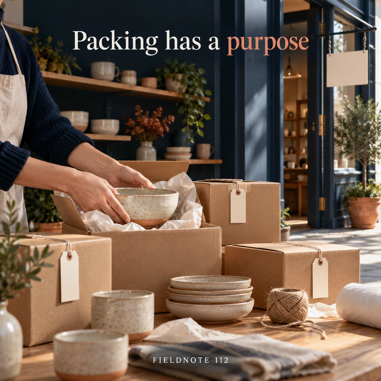
Original AI-generated fictional campaign concept. No real customer or measured result is represented.
Finished example caption — A behind-the-scenes moment explains the move without replacing the practical details.
Why use this post — Packing or transition details show the move as a process. They should not expose private orders or promise uninterrupted service.
Make it your own — State only confirmed service changes and keep customer/order information out of frame. Do not infer business continuity from a packing scene.
Image brief to adapt
Generate one complete polished square campaign image, 1080×1080. The exact scene is: hands placing ceramic stock into labeled-looking blank boxes. Context: a fictional shop packing table and new entrance with blank signage. The message is “Packing has a purpose”; support this finished caption: “A behind-the-scenes moment explains the move without replacing the practical details.”. Close editorial still life or detail crop showing the relevant physical object and its texture, with the headline in a quiet top band. Art direction: premium seasonal campaign photography with thoughtful props and uncluttered composition; palette deep navy, warm white and a restrained coral accent; refined natural lighting, deliberate depth and texture, commercially credible proportions, clean edges and ample breathing room. Use exactly this headline: “Packing has a purpose”. Add the small fictional wordmark “FIELDNOTE 112”. Headline must be immediately readable at a phone size, with high contrast and a safe inset of at least8% from every edge. The scene is the main visual, not a text-only card. No additional text, UI screenshot, testimonial, metrics, sale badge, fake website, QR code or placeholder field. No watermarks or unrelated logos. Only use verified addresses, move dates and access facts. Produce finished actual raster artwork ready to download and inspect; no wireframe, simple geometric substitute or diagram.
3. Know which location to use
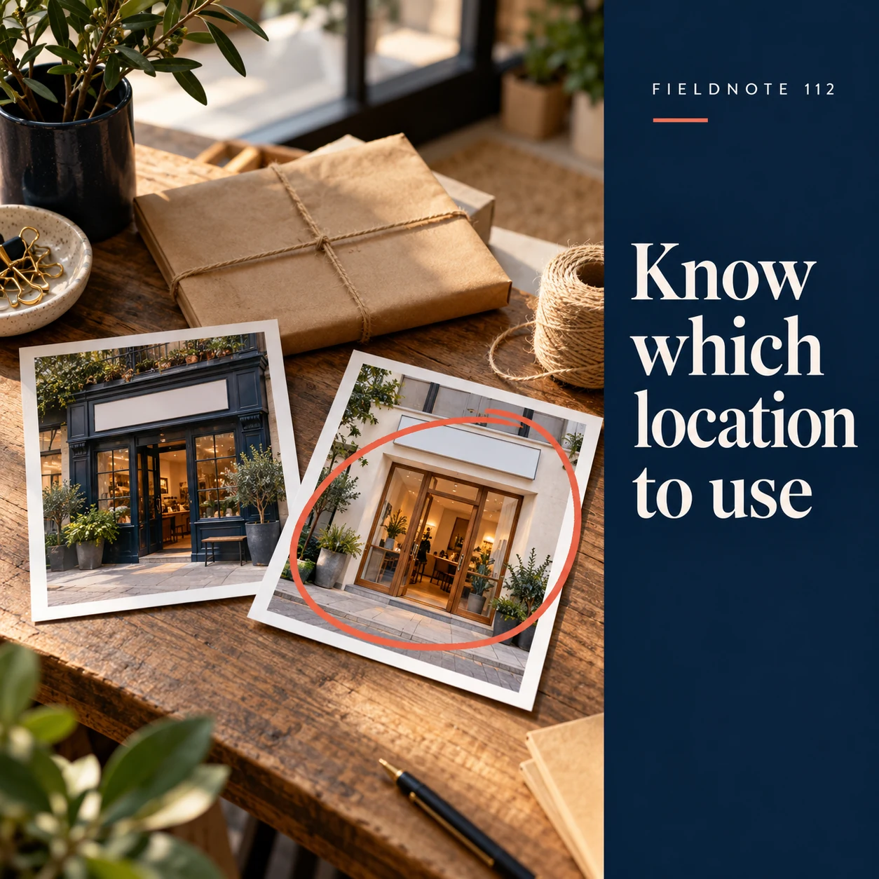
Original AI-generated fictional campaign concept. No real customer or measured result is represented.
Finished example caption — The official location page should clearly identify the current destination.
Why use this post — Visitor wayfinding requires the actual approved route. An invented landmark or map pin can make the transition more confusing.
Make it your own — Check the actual visitor page and approved wayfinding. Do not expose a private home or invent landmarks, access features or map timings.
Image brief to adapt
Generate one complete polished square campaign image, 1080×1080. The exact scene is: two separate doorway photo prints on a desk with one selected. Context: a fictional shop packing table and new entrance with blank signage. The message is “Know which location to use”; support this finished caption: “The official location page should clearly identify the current destination.”. Natural eye-level composition with a restrained side panel for type. Preserve the exact stated scene; do not add a person to an object-only scene. If the scene includes people, use adult models and the explicit stated action only. Art direction: premium seasonal campaign photography with thoughtful props and uncluttered composition; palette deep navy, warm white and a restrained coral accent; refined natural lighting, deliberate depth and texture, commercially credible proportions, clean edges and ample breathing room. Use exactly this headline: “Know which location to use”. Add the small fictional wordmark “FIELDNOTE 112”. Headline must be immediately readable at a phone size, with high contrast and a safe inset of at least8% from every edge. The scene is the main visual, not a text-only card. No additional text, UI screenshot, testimonial, metrics, sale badge, fake website, QR code or placeholder field. No watermarks or unrelated logos. Only use verified addresses, move dates and access facts. Produce finished actual raster artwork ready to download and inspect; no wireframe, simple geometric substitute or diagram.
4. Check the service transition
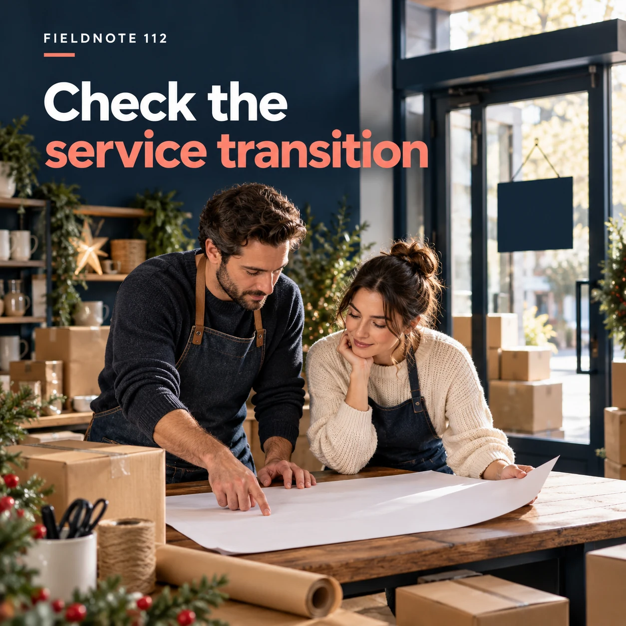
Original AI-generated fictional campaign concept. No real customer or measured result is represented.
Finished example caption — Read the current move update for any confirmed change to opening or collection.
Why use this post — The final notice keeps the current source in one place and gives the operator a correction task for obsolete posts. The artwork is not verification of a directory update.
Make it your own — List the old posts and contact records to review. Retire or correct obsolete location instructions, then inspect the current destination on a phone.
Image brief to adapt
Generate one complete polished square campaign image, 1080×1080. The exact scene is: adult staff reviewing a plain transition plan. Context: a fictional shop packing table and new entrance with blank signage. The message is “Check the service transition”; support this finished caption: “Read the current move update for any confirmed change to opening or collection.”. Confident final hero composition using a clear foreground subject and supporting background context; close the sequence with a purposeful visual invitation. Art direction: premium seasonal campaign photography with thoughtful props and uncluttered composition; palette deep navy, warm white and a restrained coral accent; refined natural lighting, deliberate depth and texture, commercially credible proportions, clean edges and ample breathing room. Use exactly this headline: “Check the service transition”. Add the small fictional wordmark “FIELDNOTE 112”. Headline must be immediately readable at a phone size, with high contrast and a safe inset of at least8% from every edge. The scene is the main visual, not a text-only card. No additional text, UI screenshot, testimonial, metrics, sale badge, fake website, QR code or placeholder field. No watermarks or unrelated logos. Only use verified addresses, move dates and access facts. Produce finished actual raster artwork ready to download and inspect; no wireframe, simple geometric substitute or diagram.
Put it into practice
Apply the workflow to one actual business image
Create this fictional transition record: business—Fieldnote Paper Room; old place—its former sample room, no longer the public visit destination; current stage—new location not yet announced; public message—“We are preparing a move. Please use our current visitor page before arranging a visit”; records to review—older location captions, collection messages and official contact information; owner—operations lead. This is a fictional planning case, not a live address notice. Before announcing a real move, supply the approved new place and effective facts, check the customer route and review obsolete instructions together.
Common questions
Should the old address disappear without an explanation?
Plan a clear transition using the actual operator-approved information. Review older posts and customer instructions so people can identify the current destination.
Does a social post confirm that a map edit is live?
No. Check the actual current listing and visitor destination separately. This guide makes no verification-time or platform-publication promise.
What if the business uses a private address?
Use only the business's approved public visit or service-area information. Do not expose a private location through a generated map, caption or background detail.
Turn the brief into your own creative
Use the example as a starting point. Supply approved business facts and authorized references in Studio, then compare the finished image with the brief before using it.
Your starter brief
Replace the brackets with your own details.
Generate one complete polished square campaign image, 1080×1080. The exact scene is: adult owner standing inside a new shop entrance. Context: a fictional shop packing table and new entrance with blank signage. The message is “A new doorway”; support this finished caption: “A clear photo can introduce the new location once the business confirms it.”. Environmental wide shot with the key subject in the lower right and generous clean upper-left negative space. Art direction: premium seasonal campaign photography with thoughtful props and uncluttered composition; palette deep navy, warm white and a restrained coral accent; refined natural lighting, deliberate depth and texture, commercially credible proportions, clean edges and ample breathing room. Use exactly this headline: “A new doorway”. Add the small fictional wordmark “FIELDNOTE 112”. Headline must be immediately readable at a phone size, with high contrast and a safe inset of at least8% from every edge. The scene is the main visual, not a text-only card. No additional text, UI screenshot, testimonial, metrics, sale badge, fake website, QR code or placeholder field. No watermarks or unrelated logos. Only use verified addresses, move dates and access facts. Produce finished actual raster artwork ready to download and inspect; no wireframe, simple geometric substitute or diagram.
Copy your adapted brief, open Studio, and paste it into your creative workflow. Review the result before using it.
Create your version in Studio