
Ad creative
Single-Image Content Review: Add Useful Alt Text and Clear Copy
By Memes.ai
Updated October 16, 2026 · 4 min read
Describe a business image by the job it does in the complete post. A useful text alternative may need the main scene, meaningful image words or a link's purpose. It does not need a list of every color and prop. These fictional café concepts show the review process. They are teaching scenes, not a certificate of accessibility. The current publishing platform's supported fields and the final image both need a separate check.
What you’ll take away
- Write the purpose of the image before writing its description.
- Read the image words and nearby caption together so necessary information is available as text without needless repetition.
- Review the actual final artwork. A prompt and a planned alt string do not establish what the generated image contains.
1. Describe the useful scene
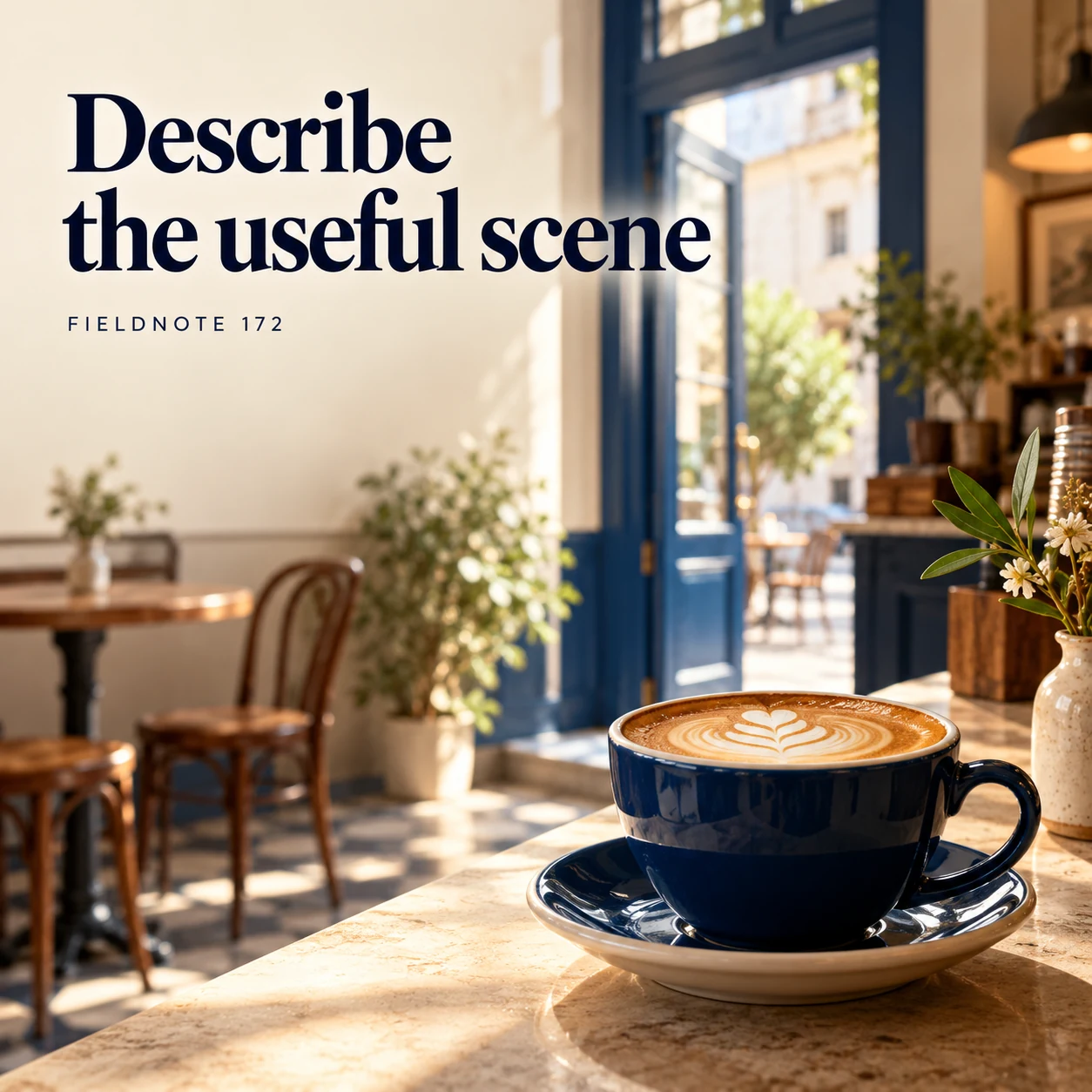
Original AI-generated fictional campaign concept. No real customer or measured result is represented.
Finished example caption — Alt text should explain the subject that matters to the post's purpose.
Why use this post — A cup and doorway can support an invitation or merely decorate it. The surrounding message determines what the reader needs from the description.
Make it your own — For an invitation concept, a sample description is “Fictional café entrance with a cup in the foreground.” Include the meaningful headline if it is not already available in adjacent text. Revise this after seeing the final asset.
Image brief to adapt
Generate one complete polished square campaign image, 1080×1080. The exact scene is: cup on a café counter beneath a short original headline. Context: a fictional café creative with cup, doorway and original headline. The message is “Describe the useful scene”; support this finished caption: “Alt text should explain the subject that matters to the post's purpose.”. Environmental wide shot with the key subject in the lower right and generous clean upper-left negative space. Art direction: art-directed studio campaign photography with strong shape, disciplined typography and useful visual hierarchy; palette ink blue, cream and vermilion; refined natural lighting, deliberate depth and texture, commercially credible proportions, clean edges and ample breathing room. Use exactly this headline: “Describe the useful scene”. Add the small fictional wordmark “FIELDNOTE 172”. Headline must be immediately readable at a phone size, with high contrast and a safe inset of at least8% from every edge. The scene is the main visual, not a text-only card. No additional text, UI screenshot, testimonial, metrics, sale badge, fake website, QR code or placeholder field. No watermarks or unrelated logos. No formal accessibility compliance guarantee; current platform behavior needs official check. Produce finished actual raster artwork ready to download and inspect; no wireframe, simple geometric substitute or diagram.
2. Keep the visible message clear
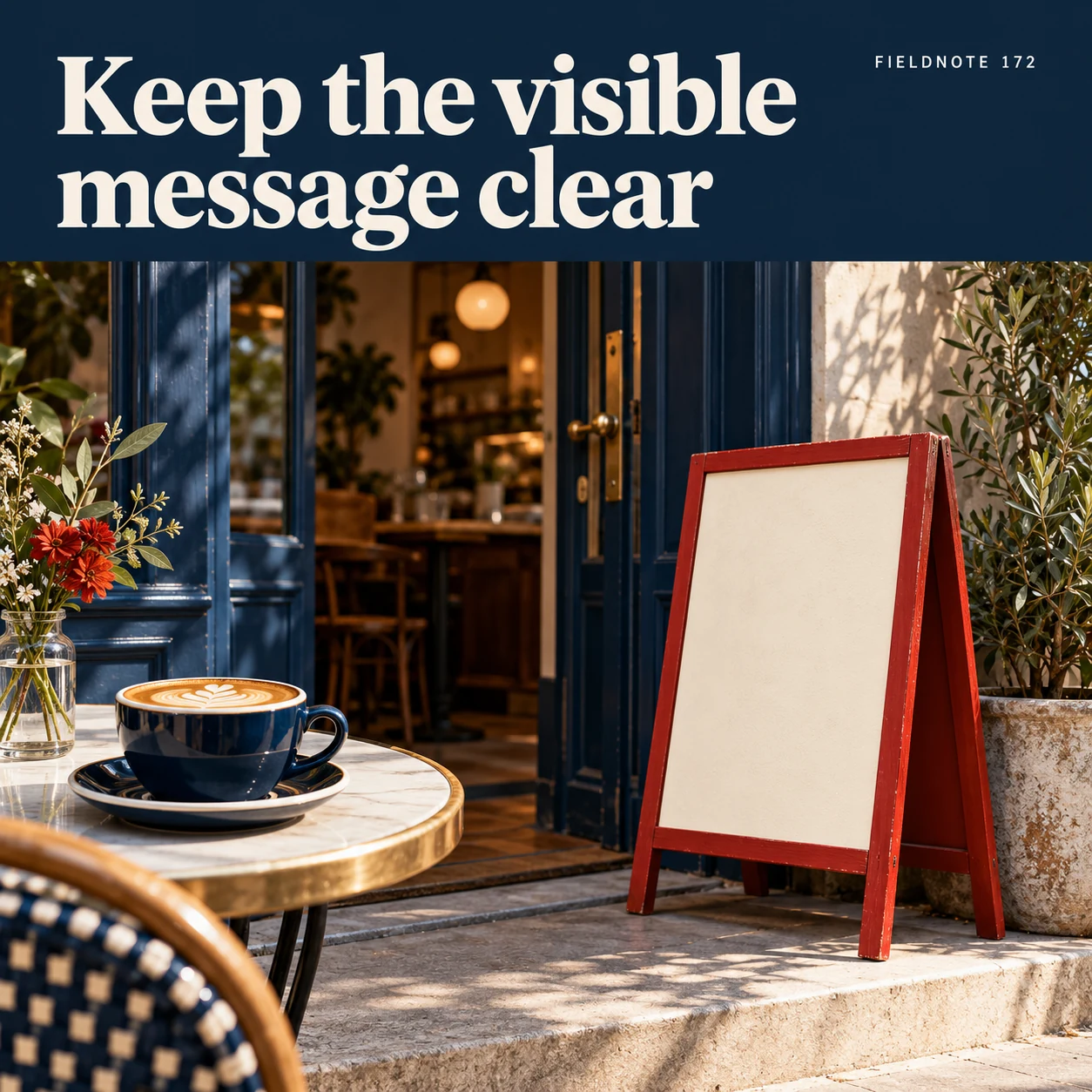
Original AI-generated fictional campaign concept. No real customer or measured result is represented.
Finished example caption — Important information should not depend on a decorative picture alone.
Why use this post — The headline and action should remain available as ordinary readable text. A decorative scene cannot carry essential instructions by itself.
Make it your own — Place the actual business information and next step in readable post text. Confirm that the image supports the same purpose rather than adding a different offer.
Image brief to adapt
Generate one complete polished square campaign image, 1080×1080. The exact scene is: café entrance with a separate plain information card. Context: a fictional café creative with cup, doorway and original headline. The message is “Keep the visible message clear”; support this finished caption: “Important information should not depend on a decorative picture alone.”. Close editorial still life or detail crop showing the relevant physical object and its texture, with the headline in a quiet top band. Art direction: art-directed studio campaign photography with strong shape, disciplined typography and useful visual hierarchy; palette ink blue, cream and vermilion; refined natural lighting, deliberate depth and texture, commercially credible proportions, clean edges and ample breathing room. Use exactly this headline: “Keep the visible message clear”. Add the small fictional wordmark “FIELDNOTE 172”. Headline must be immediately readable at a phone size, with high contrast and a safe inset of at least8% from every edge. The scene is the main visual, not a text-only card. No additional text, UI screenshot, testimonial, metrics, sale badge, fake website, QR code or placeholder field. No watermarks or unrelated logos. No formal accessibility compliance guarantee; current platform behavior needs official check. Produce finished actual raster artwork ready to download and inspect; no wireframe, simple geometric substitute or diagram.
3. Include meaningful image words
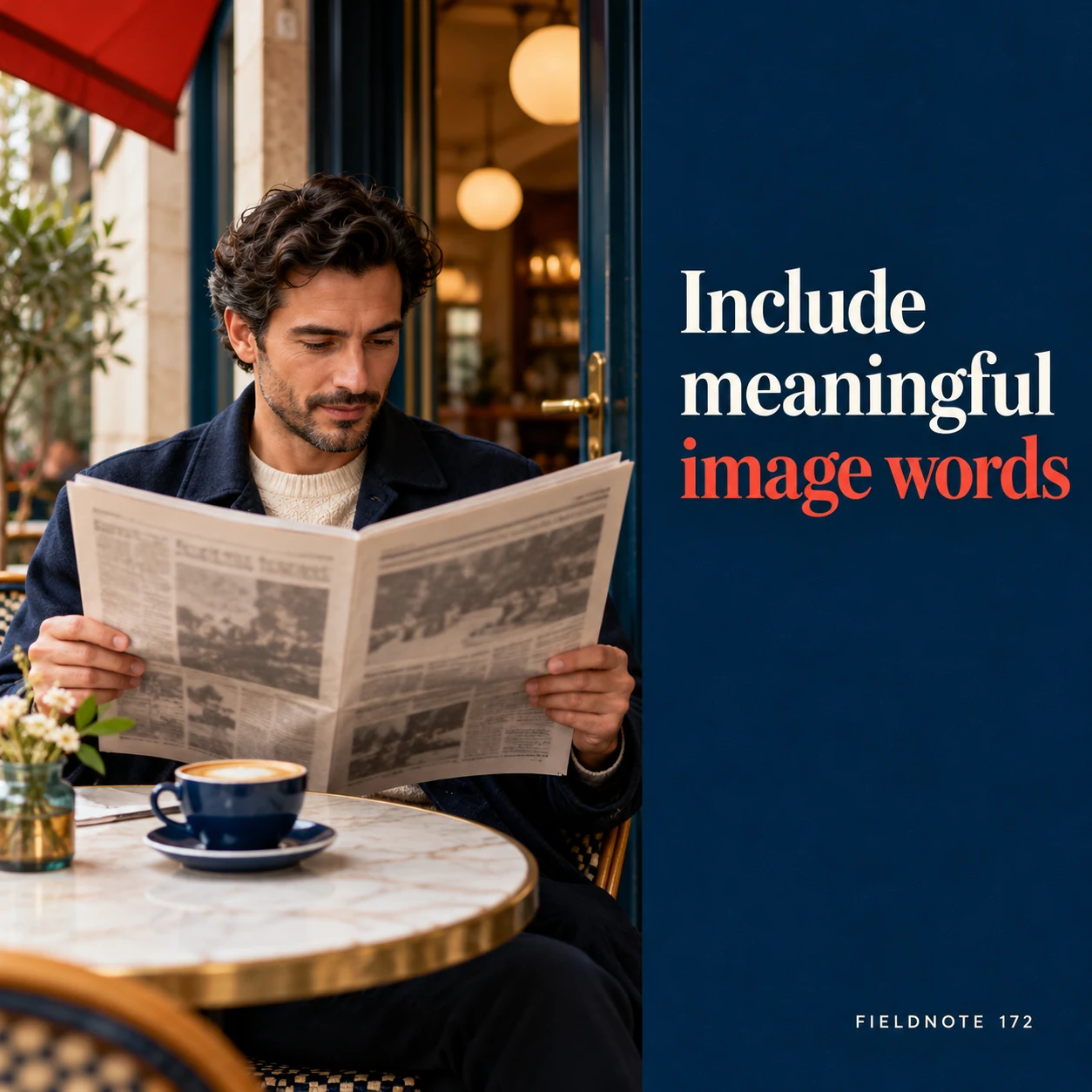
Original AI-generated fictional campaign concept. No real customer or measured result is represented.
Finished example caption — If the headline carries the point, its meaning belongs in the accessible description.
Why use this post — Meaningful image words need consideration even when the surrounding photograph is easy to describe. The reviewer must inspect the actual characters.
Make it your own — Transcribe the meaningful headline accurately when the description needs it. Do not rely on OCR or a prompt to prove that the rendered letters are correct.
Image brief to adapt
Generate one complete polished square campaign image, 1080×1080. The exact scene is: adult reviewer reading an original headline print. Context: a fictional café creative with cup, doorway and original headline. The message is “Include meaningful image words”; support this finished caption: “If the headline carries the point, its meaning belongs in the accessible description.”. Natural eye-level composition with a restrained side panel for type. Preserve the exact stated scene; do not add a person to an object-only scene. If the scene includes people, use adult models and the explicit stated action only. Art direction: art-directed studio campaign photography with strong shape, disciplined typography and useful visual hierarchy; palette ink blue, cream and vermilion; refined natural lighting, deliberate depth and texture, commercially credible proportions, clean edges and ample breathing room. Use exactly this headline: “Include meaningful image words”. Add the small fictional wordmark “FIELDNOTE 172”. Headline must be immediately readable at a phone size, with high contrast and a safe inset of at least8% from every edge. The scene is the main visual, not a text-only card. No additional text, UI screenshot, testimonial, metrics, sale badge, fake website, QR code or placeholder field. No watermarks or unrelated logos. No formal accessibility compliance guarantee; current platform behavior needs official check. Produce finished actual raster artwork ready to download and inspect; no wireframe, simple geometric substitute or diagram.
4. Review in context
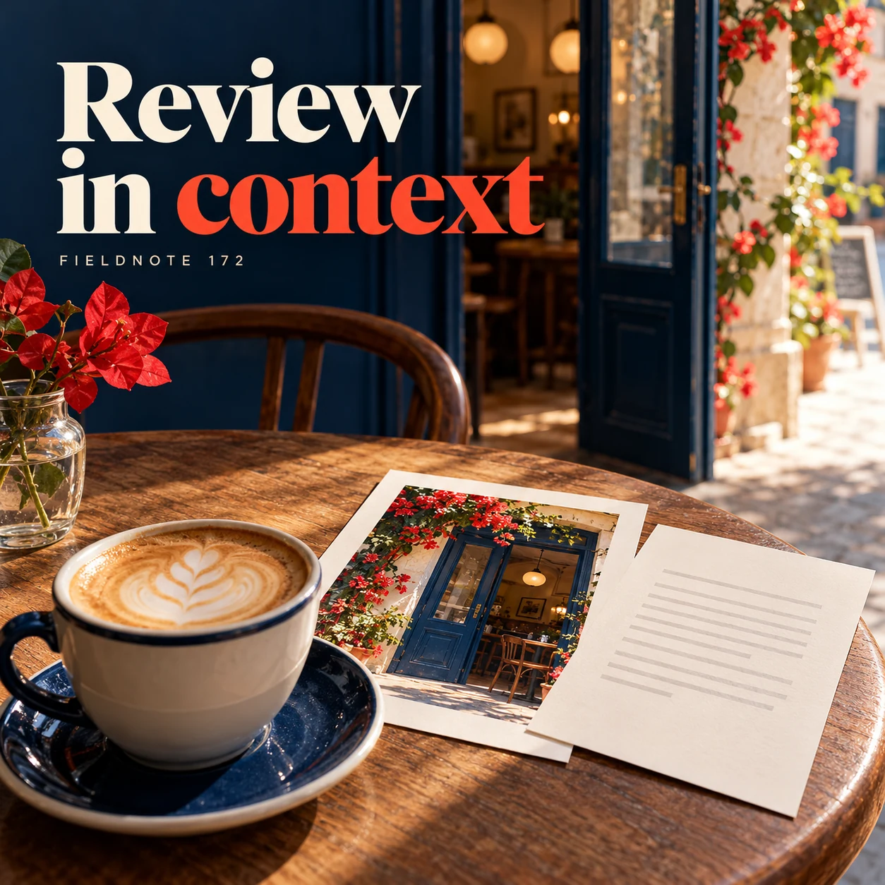
Original AI-generated fictional campaign concept. No real customer or measured result is represented.
Finished example caption — Check alt text beside the caption so the two give a coherent account.
Why use this post — Reading caption and description together reveals omissions and repeated information. It also prevents describing planned objects that are absent from the final image.
Make it your own — Read the full post without the image, then compare it with the image shown. Confirm the current platform's supported description field; do not assume HTML attribute behavior describes every social app.
Image brief to adapt
Generate one complete polished square campaign image, 1080×1080. The exact scene is: image print and plain description sheet arranged together. Context: a fictional café creative with cup, doorway and original headline. The message is “Review in context”; support this finished caption: “Check alt text beside the caption so the two give a coherent account.”. Confident final hero composition using a clear foreground subject and supporting background context; close the sequence with a purposeful visual invitation. Art direction: art-directed studio campaign photography with strong shape, disciplined typography and useful visual hierarchy; palette ink blue, cream and vermilion; refined natural lighting, deliberate depth and texture, commercially credible proportions, clean edges and ample breathing room. Use exactly this headline: “Review in context”. Add the small fictional wordmark “FIELDNOTE 172”. Headline must be immediately readable at a phone size, with high contrast and a safe inset of at least8% from every edge. The scene is the main visual, not a text-only card. No additional text, UI screenshot, testimonial, metrics, sale badge, fake website, QR code or placeholder field. No watermarks or unrelated logos. No formal accessibility compliance guarantee; current platform behavior needs official check. Produce finished actual raster artwork ready to download and inspect; no wireframe, simple geometric substitute or diagram.
Put it into practice
Apply the workflow to one actual business image
Use a fictional café image with the visible headline “A quiet place to pause” and a cup beside its entrance. First state the purpose: introduce the café's atmosphere, with no booking or availability promise. Draft this sample description: “Fictional café entrance and cup. Headline: A quiet place to pause.” Then read it beside the caption. If the same headline is already supplied as readable text, decide whether repeating it adds meaning in that context. Finally inspect the real finished asset and the actual platform preview. This exercise alone does not establish compliance.
Common questions
Should alt text list every object and color?
Describe the meaning needed for this image in this post. A short focused description may be sufficient. Add detail when it carries information rather than merely cataloguing decoration.
Must the visible headline always be repeated?
Consider whether its meaning is already available as nearby readable text and what the image does in context. Inspect the actual words. The cited W3C HTML decision tree is a guide to that judgment, not proof of every social platform's behavior.
Can this checklist certify my ad as accessible?
No. It covers one image-description task. The final asset, surrounding text, publishing interface and broader experience need their applicable checks. Do not claim legal or standards compliance from this worksheet.
Turn the brief into your own creative
Use the example as a starting point. Supply approved business facts and authorized references in Studio, then compare the finished image with the brief before using it.
Your starter brief
Replace the brackets with your own details.
Generate one complete polished square campaign image, 1080×1080. The exact scene is: cup on a café counter beneath a short original headline. Context: a fictional café creative with cup, doorway and original headline. The message is “Describe the useful scene”; support this finished caption: “Alt text should explain the subject that matters to the post's purpose.”. Environmental wide shot with the key subject in the lower right and generous clean upper-left negative space. Art direction: art-directed studio campaign photography with strong shape, disciplined typography and useful visual hierarchy; palette ink blue, cream and vermilion; refined natural lighting, deliberate depth and texture, commercially credible proportions, clean edges and ample breathing room. Use exactly this headline: “Describe the useful scene”. Add the small fictional wordmark “FIELDNOTE 172”. Headline must be immediately readable at a phone size, with high contrast and a safe inset of at least8% from every edge. The scene is the main visual, not a text-only card. No additional text, UI screenshot, testimonial, metrics, sale badge, fake website, QR code or placeholder field. No watermarks or unrelated logos. No formal accessibility compliance guarantee; current platform behavior needs official check. Produce finished actual raster artwork ready to download and inspect; no wireframe, simple geometric substitute or diagram.
Copy your adapted brief, open Studio, and paste it into your creative workflow. Review the result before using it.
Create your version in Studio