
Social media
Click-and-Collect Posts: Separate Ordering From Pickup
By Memes.ai
Updated October 16, 2026 · 4 min read
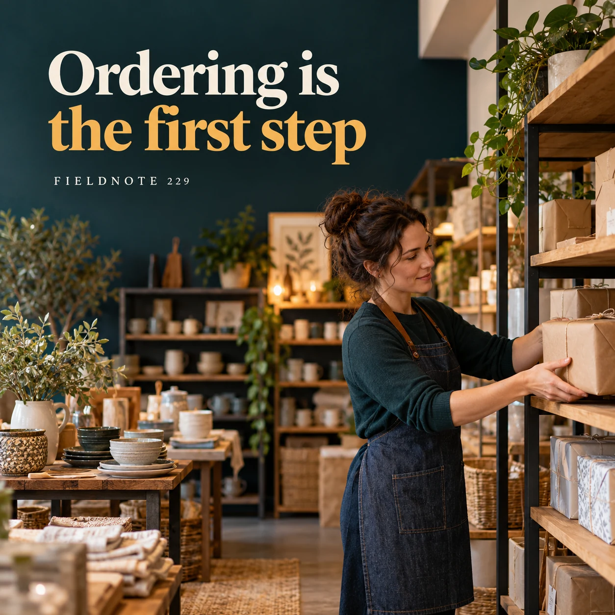
An order confirmation can arrive before a parcel is ready at the collection counter. A useful click-and-collect post explains that difference and helps the customer find the right current instructions. These fictional homeware-shop concepts show a wrapped order and a pickup point without inventing a hold period, identity requirement or opening time. The actual merchant's collection information controls.
What you’ll take away
- Separate placing an order from confirmation that it is ready to collect.
- Use the actual selected collection location and current instructions.
- Do not invent a bring-with-you rule or promise immediate readiness.
1. Ordering is the first step
Original AI-generated fictional campaign concept. No real customer or measured result is represented.
Finished example caption — Explain how the actual business confirms that an order is ready for collection.
Why use this post — A parcel being placed on a shelf illustrates preparation. It does not establish that every customer should travel immediately after ordering.
Make it your own — Say how the actual merchant confirms readiness and distinguish that from the order acknowledgement.
Image brief to adapt
Generate one complete polished square campaign image, 1080×1080. The exact scene is: adult shopkeeper placing a wrapped parcel on a collection shelf. Context: a fictional homeware shop with collection shelf and wrapped parcels. The message is “Ordering is the first step”; support this finished caption: “Explain how the actual business confirms that an order is ready for collection.”. Environmental wide shot with the key subject in the lower right and generous clean upper-left negative space. Art direction: candid small-business campaign photography, restrained graphics and a clear human focal point; palette midnight teal, warm ivory and ochre; refined natural lighting, deliberate depth and texture, commercially credible proportions, clean edges and ample breathing room. Use exactly this headline: “Ordering is the first step”. Add the small fictional wordmark “FIELDNOTE 229”. Headline must be immediately readable at a phone size, with high contrast and a safe inset of at least8% from every edge. The scene is the main visual, not a text-only card. No additional text, UI screenshot, testimonial, metrics, sale badge, fake website, QR code or placeholder field. No watermarks or unrelated logos. No instant readiness, hold-period or identity rule invention. Produce finished actual raster artwork ready to download and inspect; no wireframe, simple geometric substitute or diagram.
2. Recognize the pickup point
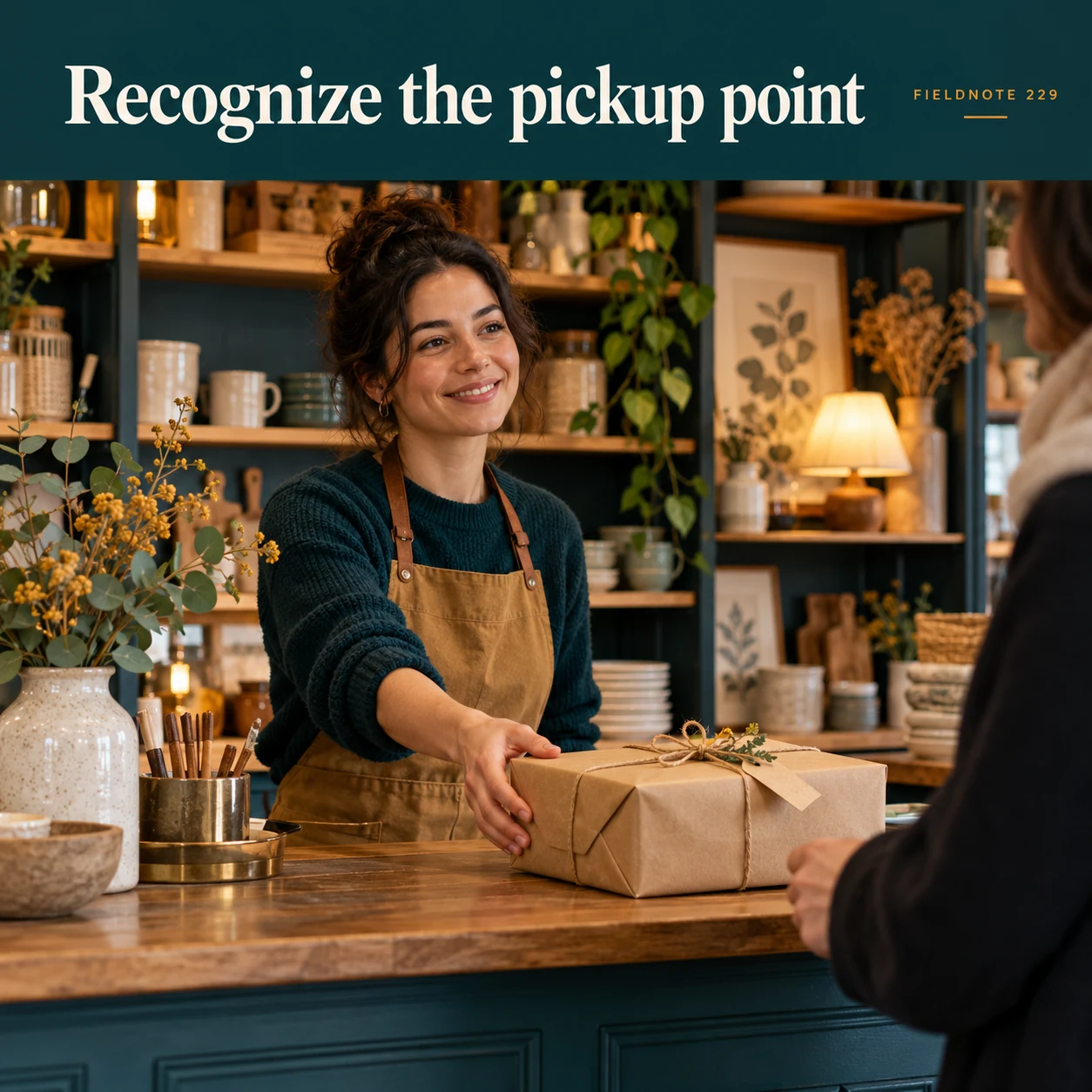
Original AI-generated fictional campaign concept. No real customer or measured result is represented.
Finished example caption — A clear permitted view can help someone find the right counter.
Why use this post — An identifiable permitted counter view can help arrival when it matches the actual selected place.
Make it your own — Show only an authorized current collection point. Check that the location matches the order instructions.
Image brief to adapt
Generate one complete polished square campaign image, 1080×1080. The exact scene is: distinct original shop counter with one wrapped parcel. Context: a fictional homeware shop with collection shelf and wrapped parcels. The message is “Recognize the pickup point”; support this finished caption: “A clear permitted view can help someone find the right counter.”. Close editorial still life or detail crop showing the relevant physical object and its texture, with the headline in a quiet top band. Art direction: candid small-business campaign photography, restrained graphics and a clear human focal point; palette midnight teal, warm ivory and ochre; refined natural lighting, deliberate depth and texture, commercially credible proportions, clean edges and ample breathing room. Use exactly this headline: “Recognize the pickup point”. Add the small fictional wordmark “FIELDNOTE 229”. Headline must be immediately readable at a phone size, with high contrast and a safe inset of at least8% from every edge. The scene is the main visual, not a text-only card. No additional text, UI screenshot, testimonial, metrics, sale badge, fake website, QR code or placeholder field. No watermarks or unrelated logos. No instant readiness, hold-period or identity rule invention. Produce finished actual raster artwork ready to download and inspect; no wireframe, simple geometric substitute or diagram.
3. Check the collection requirements
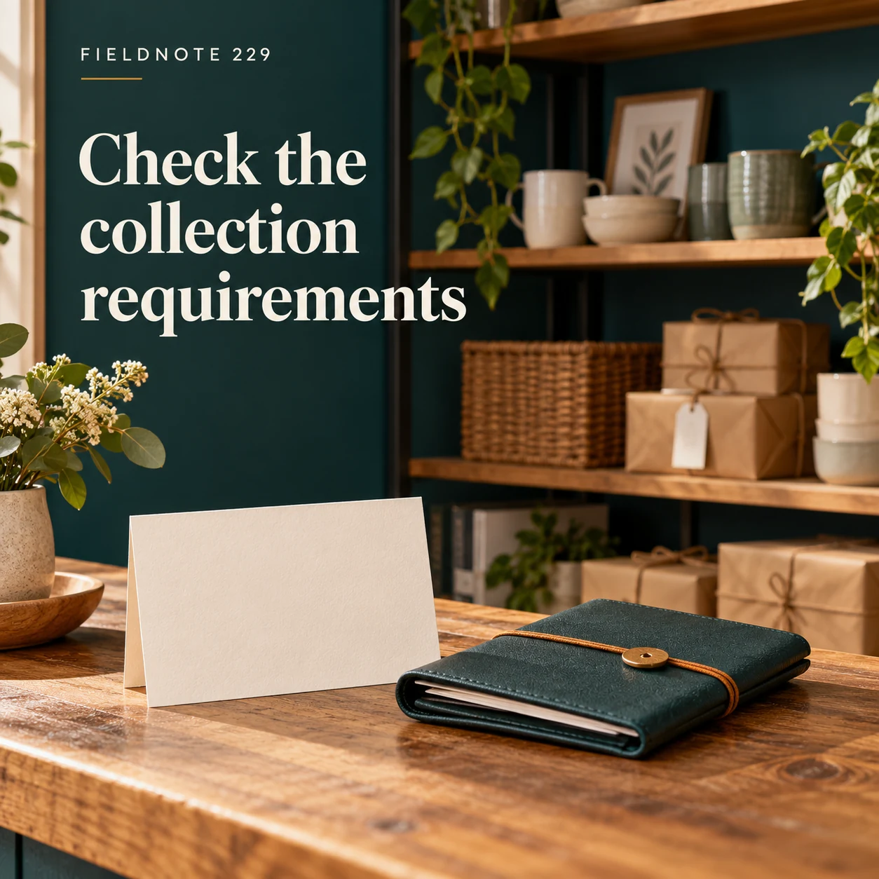
Original AI-generated fictional campaign concept. No real customer or measured result is represented.
Finished example caption — Use the business's current instructions for what the collector needs to bring.
Why use this post — A collection card is a reminder to inspect current requirements, not evidence that a universal ID or document rule exists.
Make it your own — Use exactly the merchant's approved requirements, if any. Do not put personal order details in public artwork.
Image brief to adapt
Generate one complete polished square campaign image, 1080×1080. The exact scene is: plain collection card beside a closed order folio. Context: a fictional homeware shop with collection shelf and wrapped parcels. The message is “Check the collection requirements”; support this finished caption: “Use the business's current instructions for what the collector needs to bring.”. Natural eye-level composition with a restrained side panel for type. Preserve the exact stated scene; do not add a person to an object-only scene. If the scene includes people, use adult models and the explicit stated action only. Art direction: candid small-business campaign photography, restrained graphics and a clear human focal point; palette midnight teal, warm ivory and ochre; refined natural lighting, deliberate depth and texture, commercially credible proportions, clean edges and ample breathing room. Use exactly this headline: “Check the collection requirements”. Add the small fictional wordmark “FIELDNOTE 229”. Headline must be immediately readable at a phone size, with high contrast and a safe inset of at least8% from every edge. The scene is the main visual, not a text-only card. No additional text, UI screenshot, testimonial, metrics, sale badge, fake website, QR code or placeholder field. No watermarks or unrelated logos. No instant readiness, hold-period or identity rule invention. Produce finished actual raster artwork ready to download and inspect; no wireframe, simple geometric substitute or diagram.
4. Keep the current details
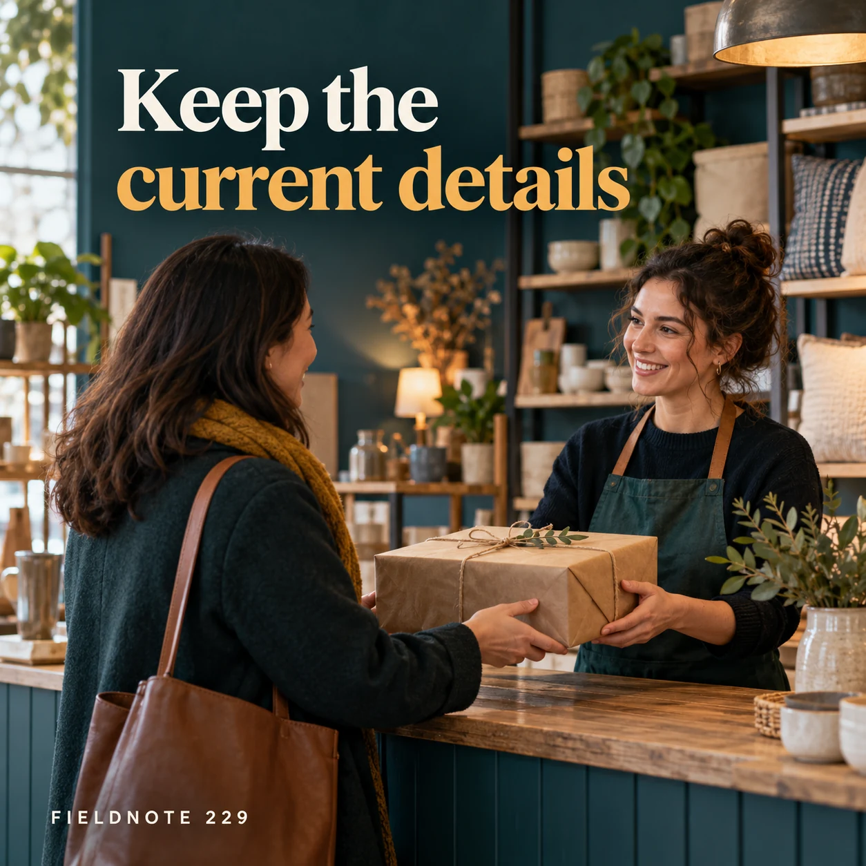
Original AI-generated fictional campaign concept. No real customer or measured result is represented.
Finished example caption — Hours and collection arrangements should come from the official information source.
Why use this post — The staff conversation directs attention to the current source, including changes after an older post was saved.
Make it your own — Link the current collection information and check the customer route before posting. Do not copy another merchant's hours or hold period.
Image brief to adapt
Generate one complete polished square campaign image, 1080×1080. The exact scene is: adult customer speaking with staff at the collection counter. Context: a fictional homeware shop with collection shelf and wrapped parcels. The message is “Keep the current details”; support this finished caption: “Hours and collection arrangements should come from the official information source.”. Confident final hero composition using a clear foreground subject and supporting background context; close the sequence with a purposeful visual invitation. Art direction: candid small-business campaign photography, restrained graphics and a clear human focal point; palette midnight teal, warm ivory and ochre; refined natural lighting, deliberate depth and texture, commercially credible proportions, clean edges and ample breathing room. Use exactly this headline: “Keep the current details”. Add the small fictional wordmark “FIELDNOTE 229”. Headline must be immediately readable at a phone size, with high contrast and a safe inset of at least8% from every edge. The scene is the main visual, not a text-only card. No additional text, UI screenshot, testimonial, metrics, sale badge, fake website, QR code or placeholder field. No watermarks or unrelated logos. No instant readiness, hold-period or identity rule invention. Produce finished actual raster artwork ready to download and inspect; no wireframe, simple geometric substitute or diagram.
Put it into practice
Apply the workflow to one actual business image
Use this fictional stage card for Fieldnote Home: order acknowledged—yes; ready-to-collect message—not yet received; customer action—wait for the business's actual readiness instructions; location—use the collection point stated in that message; public caption—“Planning to collect? Check your ready-to-collect message and the current pickup instructions before you travel.” This is an original teaching record, not a live order or real shop instruction. Pair it with the collection-shelf image, then have the merchant confirm the real readiness wording and arrival destination.
Common questions
Is an order confirmation enough to travel?
Do not assume so. Follow the actual merchant's readiness confirmation and instructions. This example deliberately separates acknowledgement from readiness.
Should every collector bring the same ID?
Requirements belong to the actual merchant and order process. Do not create a universal rule in the social caption.
Can I reuse an old pickup-counter picture?
Check that the picture and destination still match the selected current collection place. Replace or explain obsolete arrival information.
Turn the brief into your own creative
Use the example as a starting point. Supply approved business facts and authorized references in Studio, then compare the finished image with the brief before using it.
Your starter brief
Replace the brackets with your own details.
Generate one complete polished square campaign image, 1080×1080. The exact scene is: adult shopkeeper placing a wrapped parcel on a collection shelf. Context: a fictional homeware shop with collection shelf and wrapped parcels. The message is “Ordering is the first step”; support this finished caption: “Explain how the actual business confirms that an order is ready for collection.”. Environmental wide shot with the key subject in the lower right and generous clean upper-left negative space. Art direction: candid small-business campaign photography, restrained graphics and a clear human focal point; palette midnight teal, warm ivory and ochre; refined natural lighting, deliberate depth and texture, commercially credible proportions, clean edges and ample breathing room. Use exactly this headline: “Ordering is the first step”. Add the small fictional wordmark “FIELDNOTE 229”. Headline must be immediately readable at a phone size, with high contrast and a safe inset of at least8% from every edge. The scene is the main visual, not a text-only card. No additional text, UI screenshot, testimonial, metrics, sale badge, fake website, QR code or placeholder field. No watermarks or unrelated logos. No instant readiness, hold-period or identity rule invention. Produce finished actual raster artwork ready to download and inspect; no wireframe, simple geometric substitute or diagram.
Copy your adapted brief, open Studio, and paste it into your creative workflow. Review the result before using it.
Create your version in Studio