
Ad creative
Packaging Posts: Explain the Opening Experience in Stills
By Memes.ai
Updated October 16, 2026 · 4 min read
You can explain an opening sequence with four still images: closed package, first reveal, information insert and the item outside the box. Decide which view answers which question before arranging the scene. The examples use a fictional ceramic gift package and original FIELDNOTE branding. They do not show a real shipment, prove protection, or establish recyclable materials. A real product post should show the current packaging and exactly what the customer receives.
What you’ll take away
- Keep one package and product consistent through the sequence.
- Separate included items from styling props and optional extras.
- Use approved packaging and care facts; a beautiful box does not prove a performance or environmental claim.
1. Before the ribbon opens
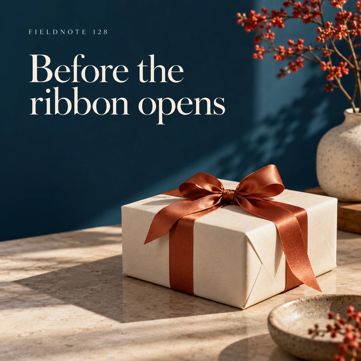
Original AI-generated fictional campaign concept. No real customer or measured result is represented.
Finished example caption — The unopened parcel introduces the gift experience before the product appears.
Why use this post — The closed package establishes the starting state. It shows the appearance of the concept without implying that every real order arrives identically.
Make it your own — Use your actual current packaging for a sales post. Confirm which ribbon, card or box is included and which element is only a styling prop.
Image brief to adapt
Generate one complete polished square campaign image, 1080×1080. The exact scene is: closed ivory parcel with copper ribbon on a table. Context: a fictional ceramic gift package with paper wrap and plain insert. The message is “Before the ribbon opens”; support this finished caption: “The unopened parcel introduces the gift experience before the product appears.”. Environmental wide shot with the key subject in the lower right and generous clean upper-left negative space. Art direction: art-directed studio campaign photography with strong shape, disciplined typography and useful visual hierarchy; palette ink blue, cream and vermilion; refined natural lighting, deliberate depth and texture, commercially credible proportions, clean edges and ample breathing room. Use exactly this headline: “Before the ribbon opens”. Add the small fictional wordmark “FIELDNOTE 128”. Headline must be immediately readable at a phone size, with high contrast and a safe inset of at least8% from every edge. The scene is the main visual, not a text-only card. No additional text, UI screenshot, testimonial, metrics, sale badge, fake website, QR code or placeholder field. No watermarks or unrelated logos. No real shipment, recyclability or protection claim from illustrative packaging. Produce finished actual raster artwork ready to download and inspect; no wireframe, simple geometric substitute or diagram.
2. The first reveal
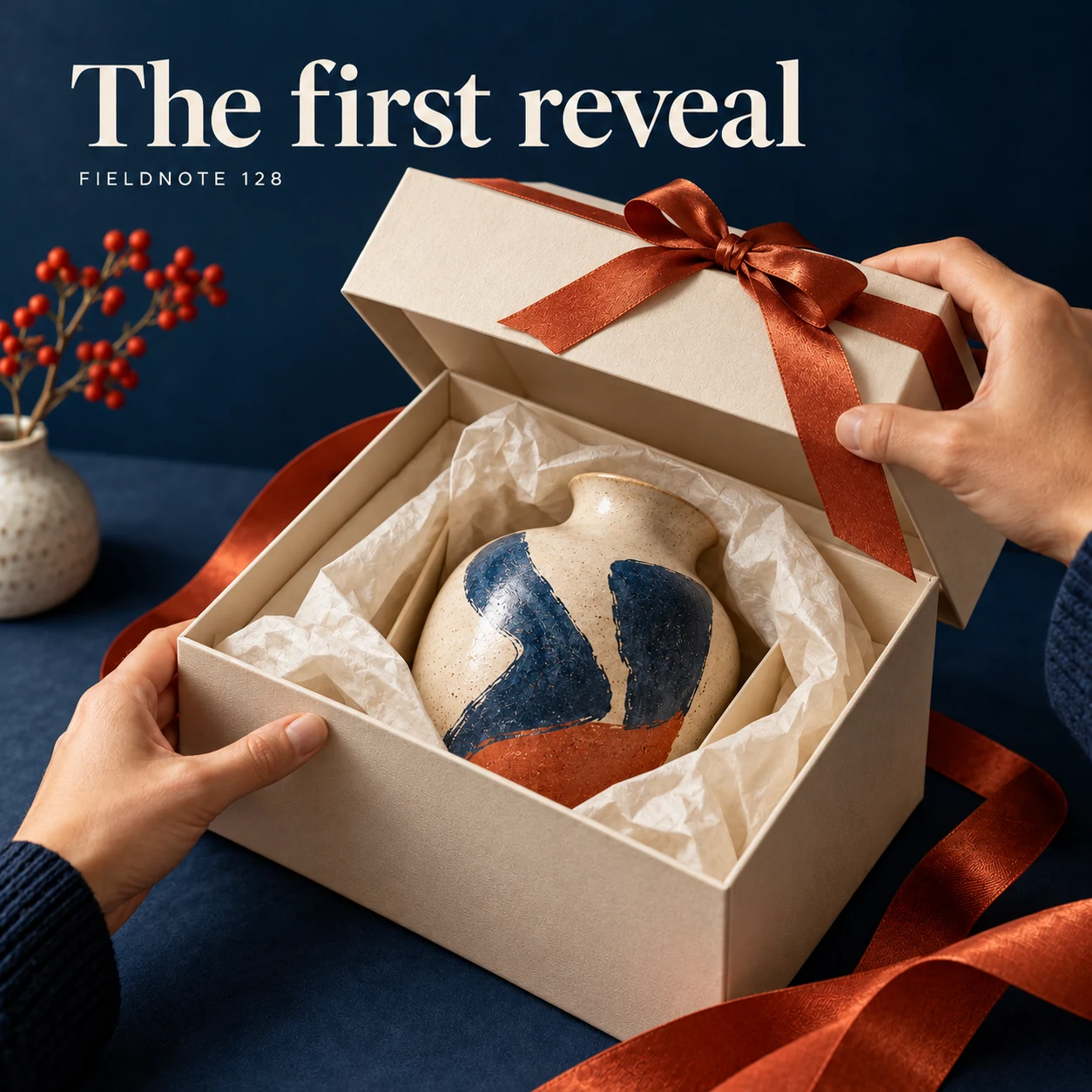
Original AI-generated fictional campaign concept. No real customer or measured result is represented.
Finished example caption — A partial opening can make the packaging sequence clear in one still.
Why use this post — A partial reveal makes the transition readable in a single frame. The same product and wrapping should remain visible so the sequence stays coherent.
Make it your own — Preserve the same item and package across the sequence. Do not add contents that are absent from the real order.
Image brief to adapt
Generate one complete polished square campaign image, 1080×1080. The exact scene is: adult hands lifting a box lid to reveal wrapped ceramic. Context: a fictional ceramic gift package with paper wrap and plain insert. The message is “The first reveal”; support this finished caption: “A partial opening can make the packaging sequence clear in one still.”. Close editorial still life or detail crop showing the relevant physical object and its texture, with the headline in a quiet top band. Art direction: art-directed studio campaign photography with strong shape, disciplined typography and useful visual hierarchy; palette ink blue, cream and vermilion; refined natural lighting, deliberate depth and texture, commercially credible proportions, clean edges and ample breathing room. Use exactly this headline: “The first reveal”. Add the small fictional wordmark “FIELDNOTE 128”. Headline must be immediately readable at a phone size, with high contrast and a safe inset of at least8% from every edge. The scene is the main visual, not a text-only card. No additional text, UI screenshot, testimonial, metrics, sale badge, fake website, QR code or placeholder field. No watermarks or unrelated logos. No real shipment, recyclability or protection claim from illustrative packaging. Produce finished actual raster artwork ready to download and inspect; no wireframe, simple geometric substitute or diagram.
3. Keep the care close
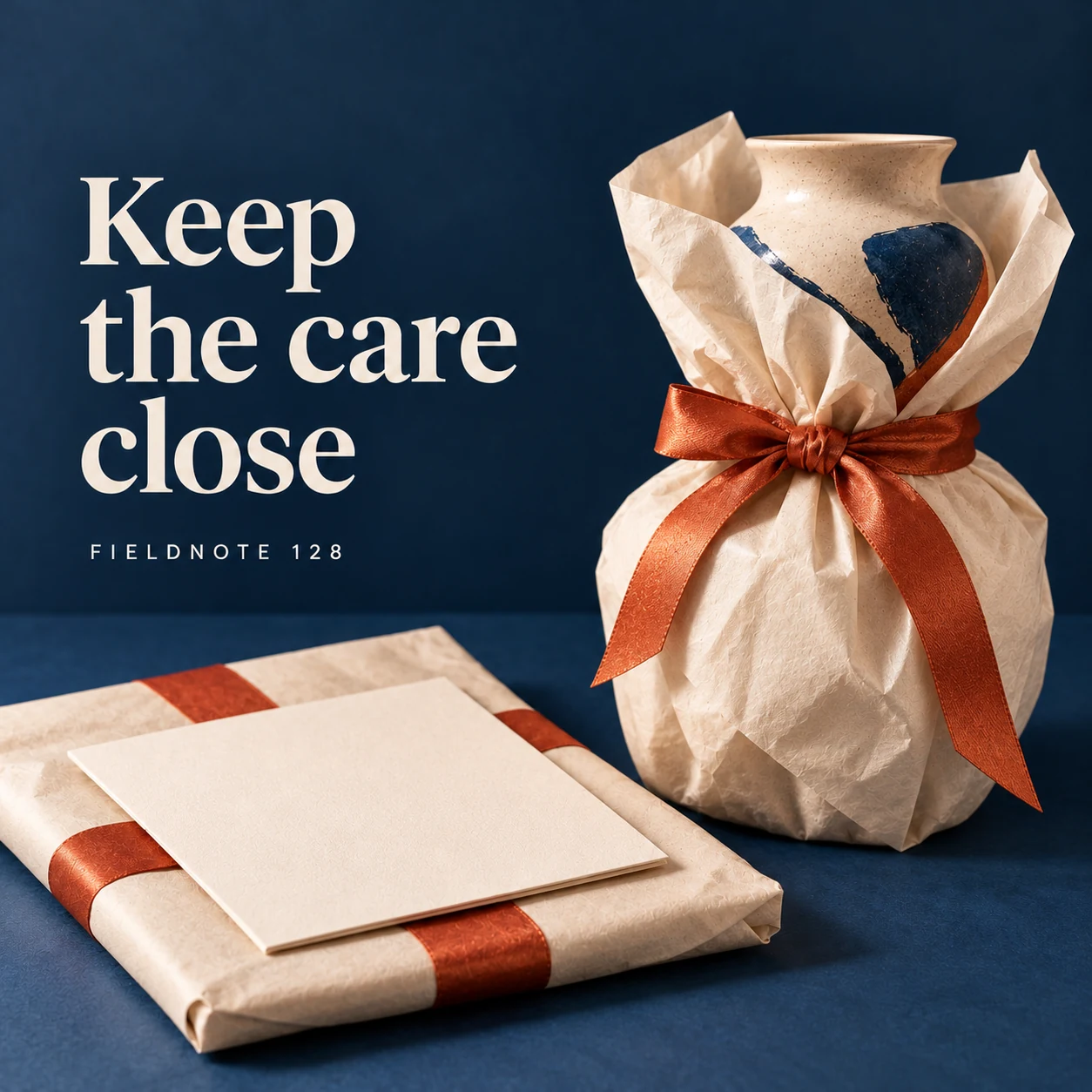
Original AI-generated fictional campaign concept. No real customer or measured result is represented.
Finished example caption — An approved care insert belongs where the recipient will find it.
Why use this post — An insert can show where useful product information belongs. Its wording must come from the actual maker rather than a generated care instruction.
Make it your own — Use the approved insert and keep personal order information out of view. Do not invent care, warranty or returns wording.
Image brief to adapt
Generate one complete polished square campaign image, 1080×1080. The exact scene is: unprinted insert resting above paper-wrapped vase. Context: a fictional ceramic gift package with paper wrap and plain insert. The message is “Keep the care close”; support this finished caption: “An approved care insert belongs where the recipient will find it.”. Natural eye-level composition with a restrained side panel for type. Preserve the exact stated scene; do not add a person to an object-only scene. If the scene includes people, use adult models and the explicit stated action only. Art direction: art-directed studio campaign photography with strong shape, disciplined typography and useful visual hierarchy; palette ink blue, cream and vermilion; refined natural lighting, deliberate depth and texture, commercially credible proportions, clean edges and ample breathing room. Use exactly this headline: “Keep the care close”. Add the small fictional wordmark “FIELDNOTE 128”. Headline must be immediately readable at a phone size, with high contrast and a safe inset of at least8% from every edge. The scene is the main visual, not a text-only card. No additional text, UI screenshot, testimonial, metrics, sale badge, fake website, QR code or placeholder field. No watermarks or unrelated logos. No real shipment, recyclability or protection claim from illustrative packaging. Produce finished actual raster artwork ready to download and inspect; no wireframe, simple geometric substitute or diagram.
4. The object takes its place
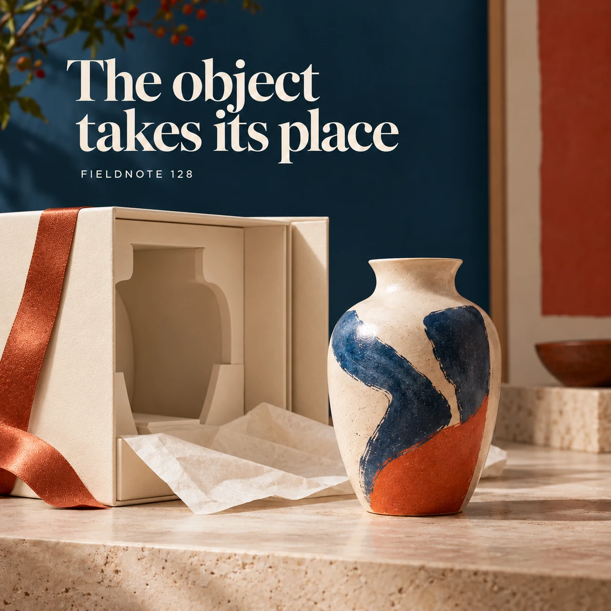
Original AI-generated fictional campaign concept. No real customer or measured result is represented.
Finished example caption — Finish the visual story with the product outside its packaging.
Why use this post — The final view distinguishes the product from its packing and props. It can answer what belongs to the purchase when the real included contents are accurately shown.
Make it your own — Name included pieces accurately in the caption or destination. Do not infer protection, recyclability or material certification from the image.
Image brief to adapt
Generate one complete polished square campaign image, 1080×1080. The exact scene is: ceramic vase beside neatly opened original packaging. Context: a fictional ceramic gift package with paper wrap and plain insert. The message is “The object takes its place”; support this finished caption: “Finish the visual story with the product outside its packaging.”. Confident final hero composition using a clear foreground subject and supporting background context; close the sequence with a purposeful visual invitation. Art direction: art-directed studio campaign photography with strong shape, disciplined typography and useful visual hierarchy; palette ink blue, cream and vermilion; refined natural lighting, deliberate depth and texture, commercially credible proportions, clean edges and ample breathing room. Use exactly this headline: “The object takes its place”. Add the small fictional wordmark “FIELDNOTE 128”. Headline must be immediately readable at a phone size, with high contrast and a safe inset of at least8% from every edge. The scene is the main visual, not a text-only card. No additional text, UI screenshot, testimonial, metrics, sale badge, fake website, QR code or placeholder field. No watermarks or unrelated logos. No real shipment, recyclability or protection claim from illustrative packaging. Produce finished actual raster artwork ready to download and inspect; no wireframe, simple geometric substitute or diagram.
Put it into practice
Build a useful four-image packaging brief
Open one real permitted sample package and make a four-frame plan. List the included product and packing components before taking photos. Capture the closed view, a first reveal, the approved information insert and the product outside the package. Compare every frame with the list so props cannot be mistaken for included items. If you use Studio to explore a packaging concept, label it clearly and keep it separate from real order evidence. Review the sequence in order before exporting.
Common questions
Can still images replace an unboxing video?
They can explain a short visual sequence, but they do not demonstrate motion, sound or a real delivery. Choose the format that answers the customer's actual question.
Can I call the box protective or recyclable from the image?
No. Those claims need their own approved product or packaging evidence. A generated scene or attractive material appearance does not establish them.
What should the final frame include?
Show the actual purchased item and accurately identify included pieces. Keep styling props or optional accessories separate so the reader knows what arrives.
Turn the brief into your own creative
Choose the example that answers your customer's question. Copy the brief into Studio, supply your own approved facts and authorized references, and review the resulting image before using it.
Your starter brief
Replace the brackets with your own details.
Generate one complete polished square campaign image, 1080×1080. The exact scene is: closed ivory parcel with copper ribbon on a table. Context: a fictional ceramic gift package with paper wrap and plain insert. The message is “Before the ribbon opens”; support this finished caption: “The unopened parcel introduces the gift experience before the product appears.”. Environmental wide shot with the key subject in the lower right and generous clean upper-left negative space. Art direction: art-directed studio campaign photography with strong shape, disciplined typography and useful visual hierarchy; palette ink blue, cream and vermilion; refined natural lighting, deliberate depth and texture, commercially credible proportions, clean edges and ample breathing room. Use exactly this headline: “Before the ribbon opens”. Add the small fictional wordmark “FIELDNOTE 128”. Headline must be immediately readable at a phone size, with high contrast and a safe inset of at least8% from every edge. The scene is the main visual, not a text-only card. No additional text, UI screenshot, testimonial, metrics, sale badge, fake website, QR code or placeholder field. No watermarks or unrelated logos. No real shipment, recyclability or protection claim from illustrative packaging. Produce finished actual raster artwork ready to download and inspect; no wireframe, simple geometric substitute or diagram.
Copy your adapted brief, open Studio, and paste it into your creative workflow. Review the result before using it.
Create your version in Studio