
Ad creative
Texture Close-Up Posts: Show What a Product Photo Misses
By Memes.ai
Updated October 16, 2026 · 4 min read
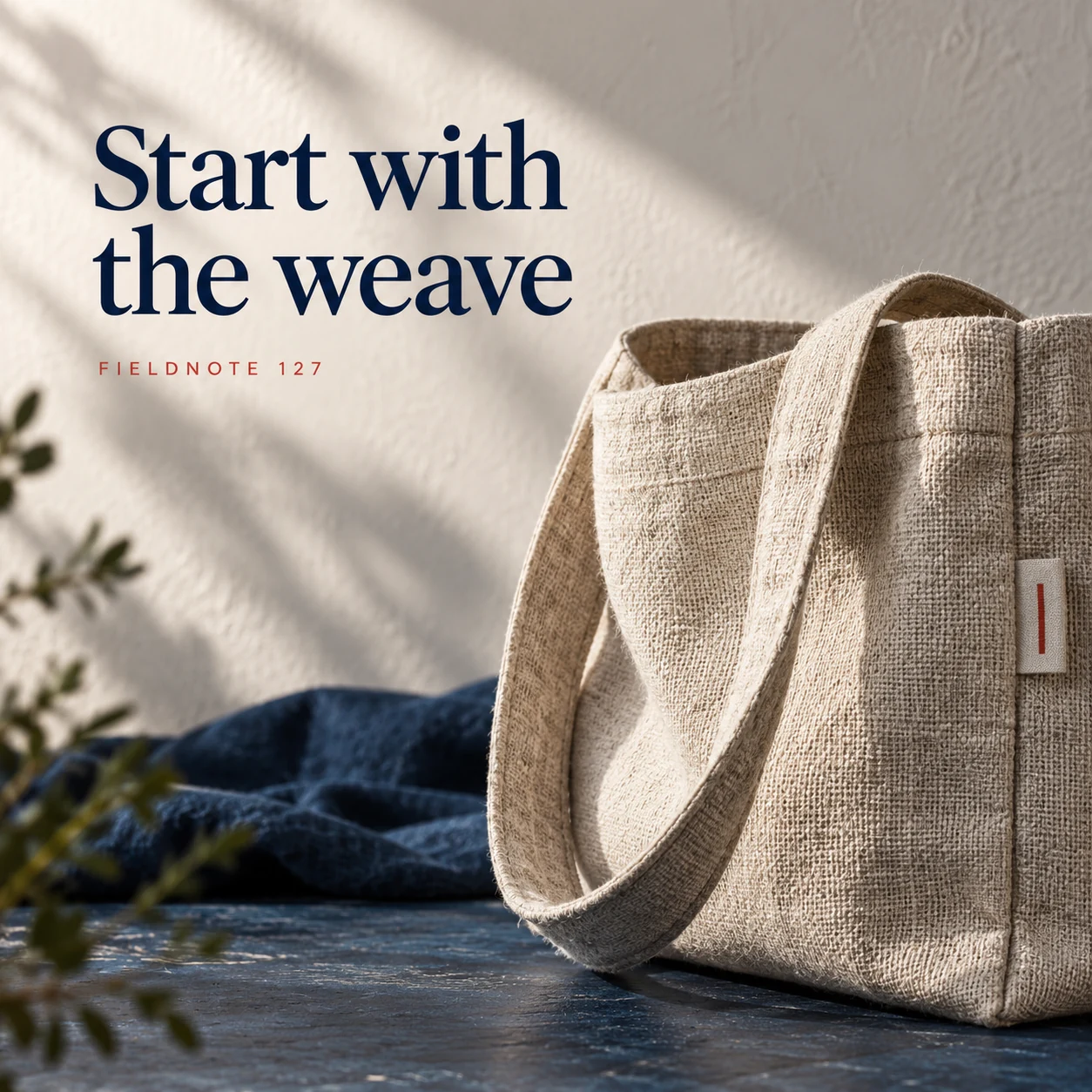
A close-up works best when the reader knows which product it belongs to. Plan the surface, seam or edge you want to show, then keep a complete view nearby. The examples use a fictional woven tote to demonstrate a texture sequence. They are original creative concepts, not evidence of linen content, durability or workmanship. When you describe a real product, use its actual photographs and the supplier's approved material facts.
What you’ll take away
- Name the specific surface or construction detail the crop should show.
- Pair a detail with the whole item so the reader can orient it.
- Keep material and durability claims tied to product records, not to an attractive texture.
1. Start with the weave
Original AI-generated fictional campaign concept. No real customer or measured result is represented.
Finished example caption — A closer view can show the surface someone cannot touch through the screen.
Why use this post — A weave crop gives a small area of the surface its own frame. It is useful for a visual description, provided the actual texture has not been invented.
Make it your own — Photograph the real material at a useful distance. Keep its color and pattern accurate; do not create an improved weave through generation.
Image brief to adapt
Generate one complete polished square campaign image, 1080×1080. The exact scene is: macro linen weave with an honest soft side light. Context: a fictional linen tote with woven fabric, seam and original label. The message is “Start with the weave”; support this finished caption: “A closer view can show the surface someone cannot touch through the screen.”. Environmental wide shot with the key subject in the lower right and generous clean upper-left negative space. Art direction: art-directed studio campaign photography with strong shape, disciplined typography and useful visual hierarchy; palette ink blue, cream and vermilion; refined natural lighting, deliberate depth and texture, commercially credible proportions, clean edges and ample breathing room. Use exactly this headline: “Start with the weave”. Add the small fictional wordmark “FIELDNOTE 127”. Headline must be immediately readable at a phone size, with high contrast and a safe inset of at least8% from every edge. The scene is the main visual, not a text-only card. No additional text, UI screenshot, testimonial, metrics, sale badge, fake website, QR code or placeholder field. No watermarks or unrelated logos. No durability, material composition or quality claim without source. Produce finished actual raster artwork ready to download and inspect; no wireframe, simple geometric substitute or diagram.
2. Follow the seam
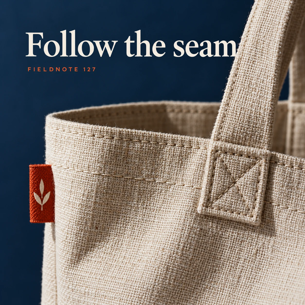
Original AI-generated fictional campaign concept. No real customer or measured result is represented.
Finished example caption — A detail can show construction without promising how long it will last.
Why use this post — A seam view can show where parts meet. It should not become an unsupported claim that the product will last longer.
Make it your own — Use the actual attachment point or seam. Avoid claiming strength, handmaking or a special process unless those facts are documented.
Image brief to adapt
Generate one complete polished square campaign image, 1080×1080. The exact scene is: close crop of tote handle attachment and stitching. Context: a fictional linen tote with woven fabric, seam and original label. The message is “Follow the seam”; support this finished caption: “A detail can show construction without promising how long it will last.”. Close editorial still life or detail crop showing the relevant physical object and its texture, with the headline in a quiet top band. Art direction: art-directed studio campaign photography with strong shape, disciplined typography and useful visual hierarchy; palette ink blue, cream and vermilion; refined natural lighting, deliberate depth and texture, commercially credible proportions, clean edges and ample breathing room. Use exactly this headline: “Follow the seam”. Add the small fictional wordmark “FIELDNOTE 127”. Headline must be immediately readable at a phone size, with high contrast and a safe inset of at least8% from every edge. The scene is the main visual, not a text-only card. No additional text, UI screenshot, testimonial, metrics, sale badge, fake website, QR code or placeholder field. No watermarks or unrelated logos. No durability, material composition or quality claim without source. Produce finished actual raster artwork ready to download and inspect; no wireframe, simple geometric substitute or diagram.
3. Return to the whole
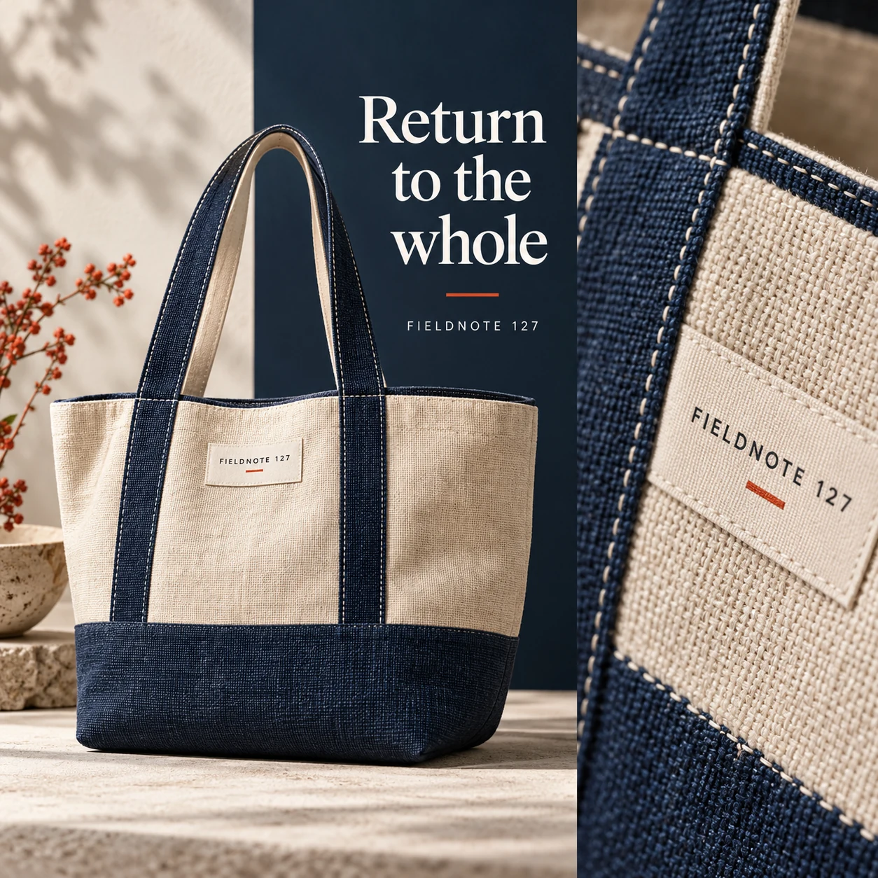
Original AI-generated fictional campaign concept. No real customer or measured result is represented.
Finished example caption — A detail works best when the reader can still identify the product.
Why use this post — A full view reconnects the crop with the item. The reader should not have to guess whether the detail belongs to the same model.
Make it your own — Show the same model and color as the close-up. Make optional accessories clear and keep the product destination consistent.
Image brief to adapt
Generate one complete polished square campaign image, 1080×1080. The exact scene is: full tote beside one tightly framed fabric detail. Context: a fictional linen tote with woven fabric, seam and original label. The message is “Return to the whole”; support this finished caption: “A detail works best when the reader can still identify the product.”. Natural eye-level composition with a restrained side panel for type. Preserve the exact stated scene; do not add a person to an object-only scene. If the scene includes people, use adult models and the explicit stated action only. Art direction: art-directed studio campaign photography with strong shape, disciplined typography and useful visual hierarchy; palette ink blue, cream and vermilion; refined natural lighting, deliberate depth and texture, commercially credible proportions, clean edges and ample breathing room. Use exactly this headline: “Return to the whole”. Add the small fictional wordmark “FIELDNOTE 127”. Headline must be immediately readable at a phone size, with high contrast and a safe inset of at least8% from every edge. The scene is the main visual, not a text-only card. No additional text, UI screenshot, testimonial, metrics, sale badge, fake website, QR code or placeholder field. No watermarks or unrelated logos. No durability, material composition or quality claim without source. Produce finished actual raster artwork ready to download and inspect; no wireframe, simple geometric substitute or diagram.
4. Keep the light consistent
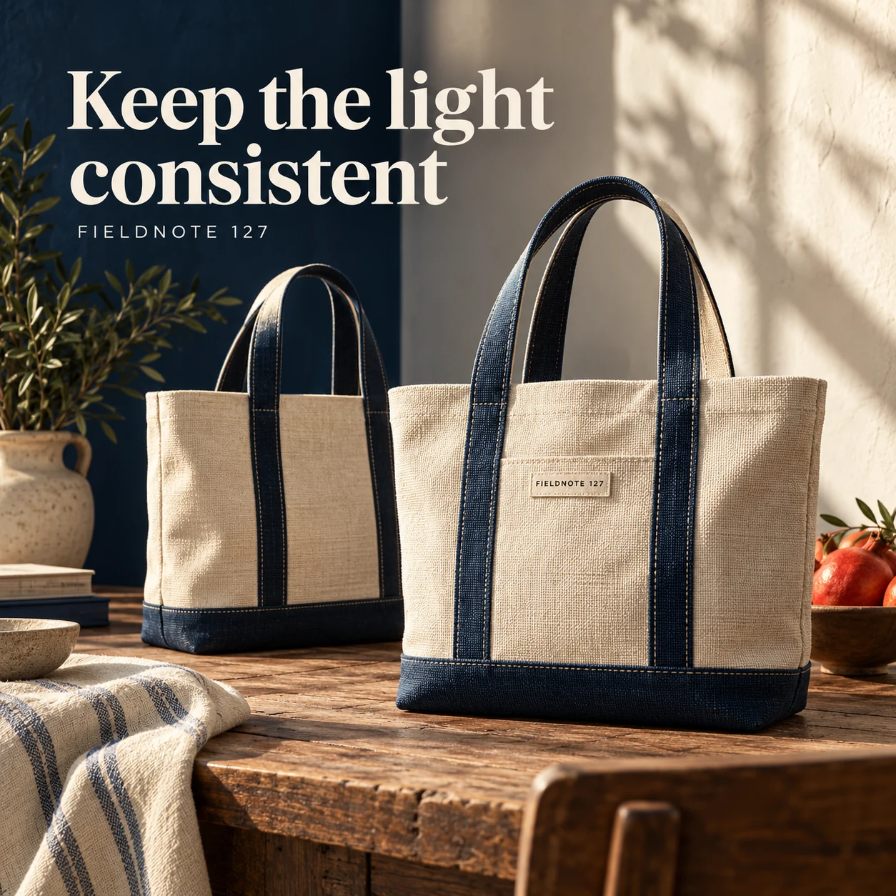
Original AI-generated fictional campaign concept. No real customer or measured result is represented.
Finished example caption — A consistent light direction helps the close-up belong to the same product story.
Why use this post — Consistent light helps the two views feel like one product story. It also makes it easier to spot a color or texture change introduced by editing.
Make it your own — Compare the finished exports under the same viewing conditions. If the crop and full view disagree, correct the mismatch before posting.
Image brief to adapt
Generate one complete polished square campaign image, 1080×1080. The exact scene is: two matching tote views on one physical photo selection table. Context: a fictional linen tote with woven fabric, seam and original label. The message is “Keep the light consistent”; support this finished caption: “A consistent light direction helps the close-up belong to the same product story.”. Confident final hero composition using a clear foreground subject and supporting background context; close the sequence with a purposeful visual invitation. Art direction: art-directed studio campaign photography with strong shape, disciplined typography and useful visual hierarchy; palette ink blue, cream and vermilion; refined natural lighting, deliberate depth and texture, commercially credible proportions, clean edges and ample breathing room. Use exactly this headline: “Keep the light consistent”. Add the small fictional wordmark “FIELDNOTE 127”. Headline must be immediately readable at a phone size, with high contrast and a safe inset of at least8% from every edge. The scene is the main visual, not a text-only card. No additional text, UI screenshot, testimonial, metrics, sale badge, fake website, QR code or placeholder field. No watermarks or unrelated logos. No durability, material composition or quality claim without source. Produce finished actual raster artwork ready to download and inspect; no wireframe, simple geometric substitute or diagram.
Put it into practice
Build a useful four-image detail brief
Choose one actual product and identify a detail that answers a buyer's question. Capture a full view and two close-ups under consistent light. Record which part of the item each crop shows. Write a caption that describes what is visible and keeps any composition or durability statement linked to the product record. Use Studio for a new concept or controlled edit only after supplying the authorized source, then compare the result with that source. Reject invented stitches, labels or material patterns.
Common questions
Can a generated close-up show the quality of my product?
It cannot establish real material quality or construction. Use accurate photographs of the actual item and keep product claims tied to approved records.
How close should I crop?
Close enough to show the named detail while retaining a useful reference to the whole product. Include a matching full view if the crop would otherwise be hard to place.
Should I remove every irregularity?
Do not edit away a characteristic that changes what a buyer will receive. Keep the image accurate to the actual item and disclose relevant variation through the product information.
Turn the brief into your own creative
Choose the example that answers your customer's question. Copy the brief into Studio, supply your own approved facts and authorized references, and review the resulting image before using it.
Your starter brief
Replace the brackets with your own details.
Generate one complete polished square campaign image, 1080×1080. The exact scene is: macro linen weave with an honest soft side light. Context: a fictional linen tote with woven fabric, seam and original label. The message is “Start with the weave”; support this finished caption: “A closer view can show the surface someone cannot touch through the screen.”. Environmental wide shot with the key subject in the lower right and generous clean upper-left negative space. Art direction: art-directed studio campaign photography with strong shape, disciplined typography and useful visual hierarchy; palette ink blue, cream and vermilion; refined natural lighting, deliberate depth and texture, commercially credible proportions, clean edges and ample breathing room. Use exactly this headline: “Start with the weave”. Add the small fictional wordmark “FIELDNOTE 127”. Headline must be immediately readable at a phone size, with high contrast and a safe inset of at least8% from every edge. The scene is the main visual, not a text-only card. No additional text, UI screenshot, testimonial, metrics, sale badge, fake website, QR code or placeholder field. No watermarks or unrelated logos. No durability, material composition or quality claim without source. Produce finished actual raster artwork ready to download and inspect; no wireframe, simple geometric substitute or diagram.
Copy your adapted brief, open Studio, and paste it into your creative workflow. Review the result before using it.
Create your version in Studio