
Ad creative
Single-Image Ad Hierarchy: Choose What Readers See First
By Memes.ai
Updated October 16, 2026 · 5 min read
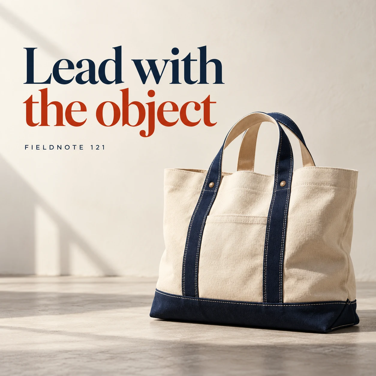
Decide what a reader should notice first before adding more elements. The examples use a fictional canvas bag to show four hierarchy choices: lead with the object, reserve headline space, keep a detail secondary and give the post one direction. They are layout concepts rather than measured winning ads. Use the actual product and approved message when making your own version. A square teaching image is not automatically suitable for every ad placement.
What you’ll take away
- Give the image one clear focal point.
- Decide which words belong in the picture and which belong in the caption.
- Review the actual exported crop before approving a layout.
1. Lead with the object
Original AI-generated fictional campaign concept. No real customer or measured result is represented.
Finished example caption — Let the bag become the focal point before the words explain the idea.
Why use this post — A large product view gives the reader a place to begin. It keeps the advertised object visible instead of making the logo the whole message.
Make it your own — Use the actual item and preserve its proportions. Choose the product or action that explains the message, not an unrelated dramatic prop.
Image brief to adapt
Generate one complete polished square campaign image, 1080×1080. The exact scene is: large canvas bag against a restrained ivory backdrop. Context: a fictional canvas-bag brand in a clean product studio. The message is “Lead with the object”; support this finished caption: “Let the bag become the focal point before the words explain the idea.”. Environmental wide shot with the key subject in the lower right and generous clean upper-left negative space. Art direction: art-directed studio campaign photography with strong shape, disciplined typography and useful visual hierarchy; palette ink blue, cream and vermilion; refined natural lighting, deliberate depth and texture, commercially credible proportions, clean edges and ample breathing room. Use exactly this headline: “Lead with the object”. Add the small fictional wordmark “FIELDNOTE 121”. Headline must be immediately readable at a phone size, with high contrast and a safe inset of at least8% from every edge. The scene is the main visual, not a text-only card. No additional text, UI screenshot, testimonial, metrics, sale badge, fake website, QR code or placeholder field. No watermarks or unrelated logos. No performance claim from visual hierarchy alone. Produce finished actual raster artwork ready to download and inspect; no wireframe, simple geometric substitute or diagram.
2. Give the headline space
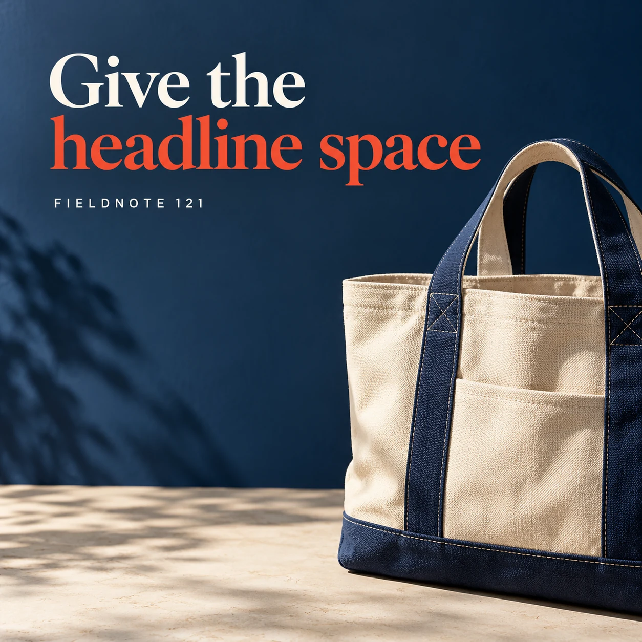
Original AI-generated fictional campaign concept. No real customer or measured result is represented.
Finished example caption — A quieter background gives a short message room to be read.
Why use this post — An open area allows the headline to be read without covering the object. This is a composition choice rather than a universal rule about which side text belongs on.
Make it your own — Shorten the approved headline before shrinking the object. Check the final crop rather than trusting the working canvas.
Image brief to adapt
Generate one complete polished square campaign image, 1080×1080. The exact scene is: bag on right with open wall space on left. Context: a fictional canvas-bag brand in a clean product studio. The message is “Give the headline space”; support this finished caption: “A quieter background gives a short message room to be read.”. Close editorial still life or detail crop showing the relevant physical object and its texture, with the headline in a quiet top band. Art direction: art-directed studio campaign photography with strong shape, disciplined typography and useful visual hierarchy; palette ink blue, cream and vermilion; refined natural lighting, deliberate depth and texture, commercially credible proportions, clean edges and ample breathing room. Use exactly this headline: “Give the headline space”. Add the small fictional wordmark “FIELDNOTE 121”. Headline must be immediately readable at a phone size, with high contrast and a safe inset of at least8% from every edge. The scene is the main visual, not a text-only card. No additional text, UI screenshot, testimonial, metrics, sale badge, fake website, QR code or placeholder field. No watermarks or unrelated logos. No performance claim from visual hierarchy alone. Produce finished actual raster artwork ready to download and inspect; no wireframe, simple geometric substitute or diagram.
3. Keep detail subordinate
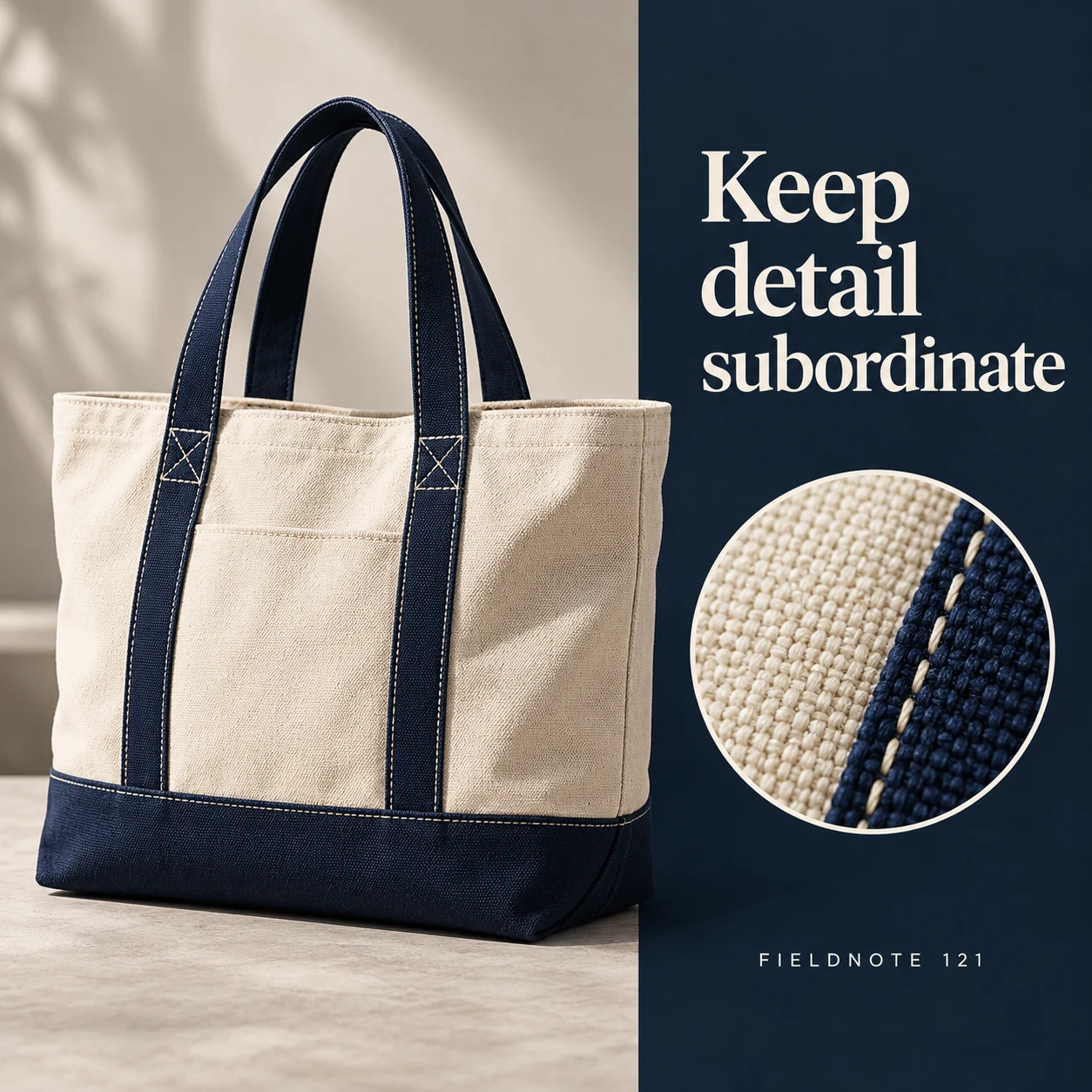
Original AI-generated fictional campaign concept. No real customer or measured result is represented.
Finished example caption — A close fabric view can support the main message without competing with it.
Why use this post — A small detail can answer a second question once the product is understood. Giving every element equal emphasis would remove that order.
Make it your own — Choose a real documented detail. Do not use a generated close-up as proof of material or construction.
Image brief to adapt
Generate one complete polished square campaign image, 1080×1080. The exact scene is: bag fabric macro inset beside the full product. Context: a fictional canvas-bag brand in a clean product studio. The message is “Keep detail subordinate”; support this finished caption: “A close fabric view can support the main message without competing with it.”. Natural eye-level composition with a restrained side panel for type. Preserve the exact stated scene; do not add a person to an object-only scene. If the scene includes people, use adult models and the explicit stated action only. Art direction: art-directed studio campaign photography with strong shape, disciplined typography and useful visual hierarchy; palette ink blue, cream and vermilion; refined natural lighting, deliberate depth and texture, commercially credible proportions, clean edges and ample breathing room. Use exactly this headline: “Keep detail subordinate”. Add the small fictional wordmark “FIELDNOTE 121”. Headline must be immediately readable at a phone size, with high contrast and a safe inset of at least8% from every edge. The scene is the main visual, not a text-only card. No additional text, UI screenshot, testimonial, metrics, sale badge, fake website, QR code or placeholder field. No watermarks or unrelated logos. No performance claim from visual hierarchy alone. Produce finished actual raster artwork ready to download and inspect; no wireframe, simple geometric substitute or diagram.
4. End with one direction
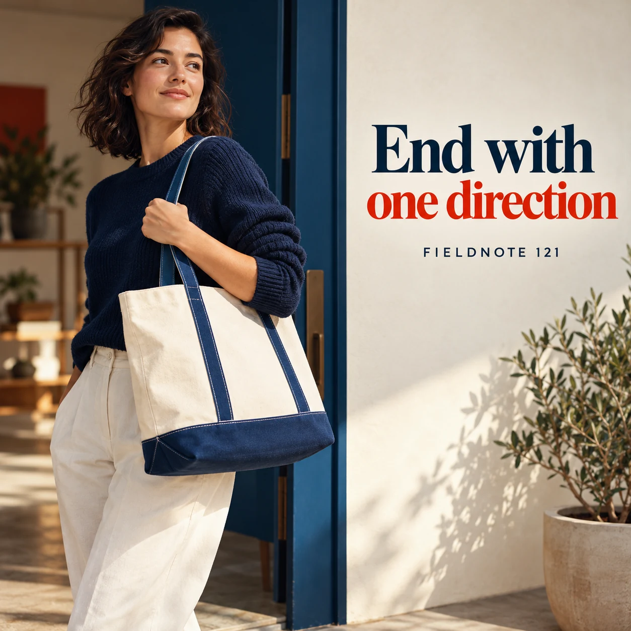
Original AI-generated fictional campaign concept. No real customer or measured result is represented.
Finished example caption — Choose one next step so the creative has a clear purpose.
Why use this post — One next direction helps the post stay focused. The destination must actually support that direction.
Make it your own — Use one accurate next step and a matching destination. Do not render a fake clickable button into the image.
Image brief to adapt
Generate one complete polished square campaign image, 1080×1080. The exact scene is: adult shopper holding the bag beside a simple exit-side text panel. Context: a fictional canvas-bag brand in a clean product studio. The message is “End with one direction”; support this finished caption: “Choose one next step so the creative has a clear purpose.”. Confident final hero composition using a clear foreground subject and supporting background context; close the sequence with a purposeful visual invitation. Art direction: art-directed studio campaign photography with strong shape, disciplined typography and useful visual hierarchy; palette ink blue, cream and vermilion; refined natural lighting, deliberate depth and texture, commercially credible proportions, clean edges and ample breathing room. Use exactly this headline: “End with one direction”. Add the small fictional wordmark “FIELDNOTE 121”. Headline must be immediately readable at a phone size, with high contrast and a safe inset of at least8% from every edge. The scene is the main visual, not a text-only card. No additional text, UI screenshot, testimonial, metrics, sale badge, fake website, QR code or placeholder field. No watermarks or unrelated logos. No performance claim from visual hierarchy alone. Produce finished actual raster artwork ready to download and inspect; no wireframe, simple geometric substitute or diagram.
Put it into practice
Apply the workflow to one actual business image
Place one approved product reference and one message on a blank canvas. Mark what should be seen first, second and third. Make one product-led arrangement and one headline-led arrangement, then view both at their intended display size. Ask a reviewer to describe the focal point without an explanation. Remove an element if it competes with the required message. In Studio, request the chosen composition and compare the resulting product and lettering with the approved inputs.
Put it into practice
Check the headline, supporting text and mark as one layout
Use one fixed message to compare layouts. In this original fictional brief, the product is a blue desk folder, the image headline is “One clear place to start,” and the caption explains the folder's intended use without adding a price or performance claim. The supplied Fieldnote wordmark identifies the fictional brand. The product shape, wording and mark stay fixed while the composition changes.
In layout A, let the folder occupy the main visual area and reserve a quiet space for the headline. Put the supporting explanation in the caption. In layout B, let the headline lead and give the folder a clear secondary position. Neither choice makes the wordmark the whole advertisement. Compare what a reviewer notices first, second and third without telling them what you intended.
Then review the actual export. Negative space is useful only if the words fit clearly in it. Brand color is not a reason to leave a headline indistinct against the scene. Move or simplify the background, adjust the arrangement within the approved palette or shorten the approved message through review. Keep the actual product color unchanged. The mark should remain recognizable without competing with the message. This exercise reviews communication; it does not predict which layout will sell more.
Common questions
Must the headline always be the largest element?
No. Choose the visual order needed for this message. A product demonstration may need the object to lead; an announcement may need the short message to lead. Check the finished result.
Can I put all the explanation in the image?
You can choose the format, but a crowded image can hide the main point. Keep supporting context in the caption when it does not need to be visible in the graphic.
Does a clear hierarchy guarantee better advertising results?
No. This workflow reviews communication and layout. Business results require actual delivery and outcome evidence.
Where should the wordmark go?
Choose a clear place within the composition that preserves the supplied mark and the main message. Check the final crop and use guidance; this guide does not impose one corner or a universal size rule.
Does negative space mean leaving a fixed percentage empty?
No. Reserve enough clear space for the actual message and placement. Judge the final exported image rather than a decorative percentage.
Turn the brief into your own creative
Use the example as a starting point. Supply approved business facts and authorized references in Studio, then compare the finished image with the brief before using it.
Your starter brief
Replace the brackets with your own details.
Generate one complete polished square campaign image, 1080×1080. The exact scene is: large canvas bag against a restrained ivory backdrop. Context: a fictional canvas-bag brand in a clean product studio. The message is “Lead with the object”; support this finished caption: “Let the bag become the focal point before the words explain the idea.”. Environmental wide shot with the key subject in the lower right and generous clean upper-left negative space. Art direction: art-directed studio campaign photography with strong shape, disciplined typography and useful visual hierarchy; palette ink blue, cream and vermilion; refined natural lighting, deliberate depth and texture, commercially credible proportions, clean edges and ample breathing room. Use exactly this headline: “Lead with the object”. Add the small fictional wordmark “FIELDNOTE 121”. Headline must be immediately readable at a phone size, with high contrast and a safe inset of at least8% from every edge. The scene is the main visual, not a text-only card. No additional text, UI screenshot, testimonial, metrics, sale badge, fake website, QR code or placeholder field. No watermarks or unrelated logos. No performance claim from visual hierarchy alone. Produce finished actual raster artwork ready to download and inspect; no wireframe, simple geometric substitute or diagram.
Copy your adapted brief, open Studio, and paste it into your creative workflow. Review the result before using it.
Create your version in Studio